Search items

Jump to an item

0.4.0iOS 26+MIT

Native-first SwiftUI you copy and own.

A registry of SwiftUI product UI, like shadcn/ui. Search a local catalog, copy real source, theme once, own every line. Apple controls stay visible; the registry only styles and composes them.

38
components
11
blocks
25
recipes
7
theme presets

Set up once, use everywhere

  1. 1. Add foundations
    One small package carries the theme contract: accent, surfaces, borders, semantic colors, metrics.
    // Package.swift
    dependencies: [
        .package(url: "https://github.com/mangobyte-dev/swiftui-ui-registry.git", .upToNextMinor(from: "0.3.0"))
    ]
    
    // In the consuming target's dependencies:
    .product(name: "SwiftUIRegistryFoundations", package: "swiftui-ui-registry")
  2. 2. Theme the root
    Pick a preset or compose on Create; items below inherit it, controls follow the tint.
    ContentView()
        .registryTheme(.graphite)
  3. 3. Install an item
    Copies item + dependency closure to target; receipt merges updates, not overwrites.
    swiftui-registry install auth-form --destination Sources/YourFeature/Components

Tune device

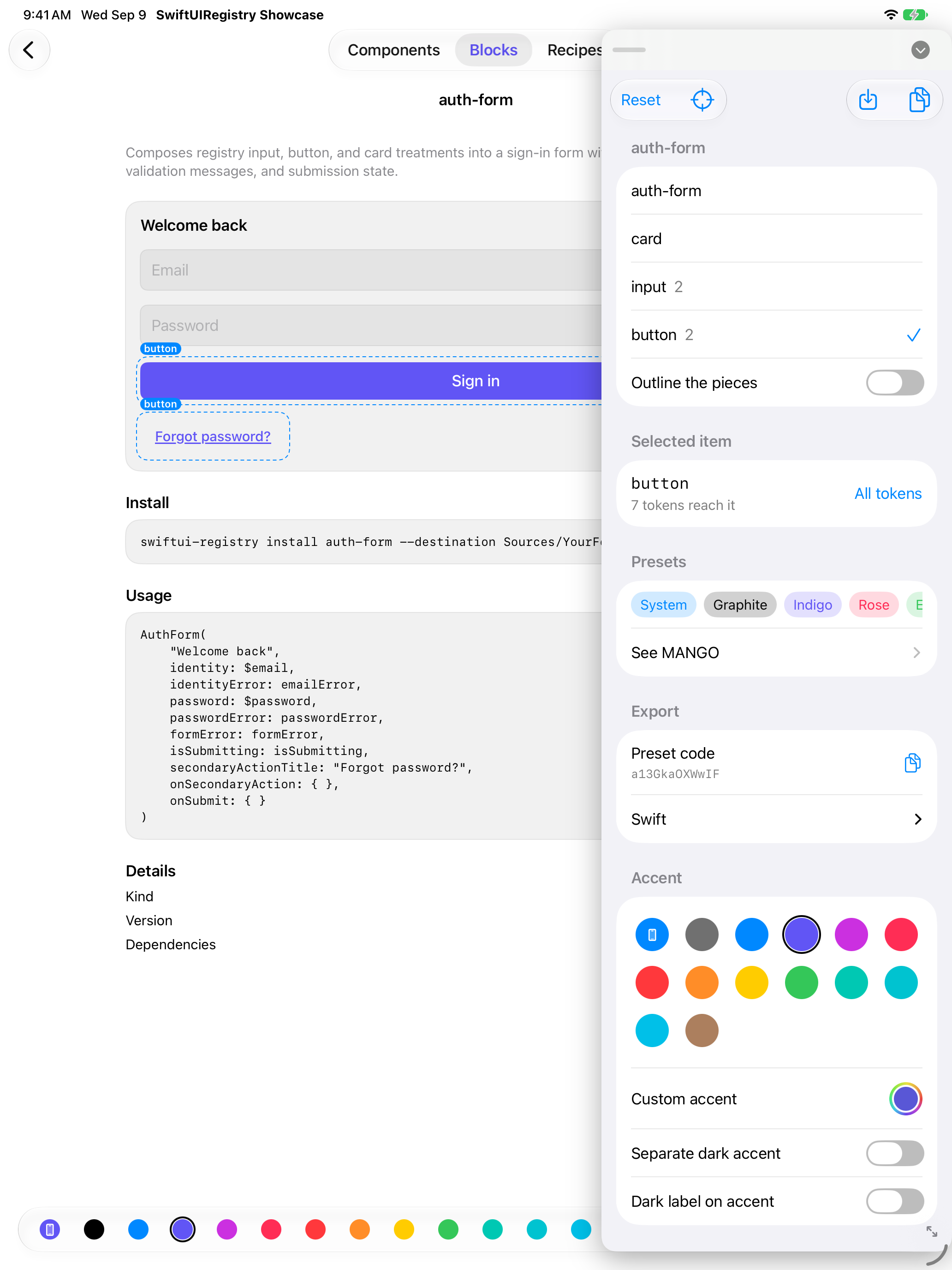
Since 0.3.0: the design surface floats a panel over your running app. Select an item, it scopes to that item's tokens; move a knob and the app changes live. Export a preset or Swift code; release unchanged.
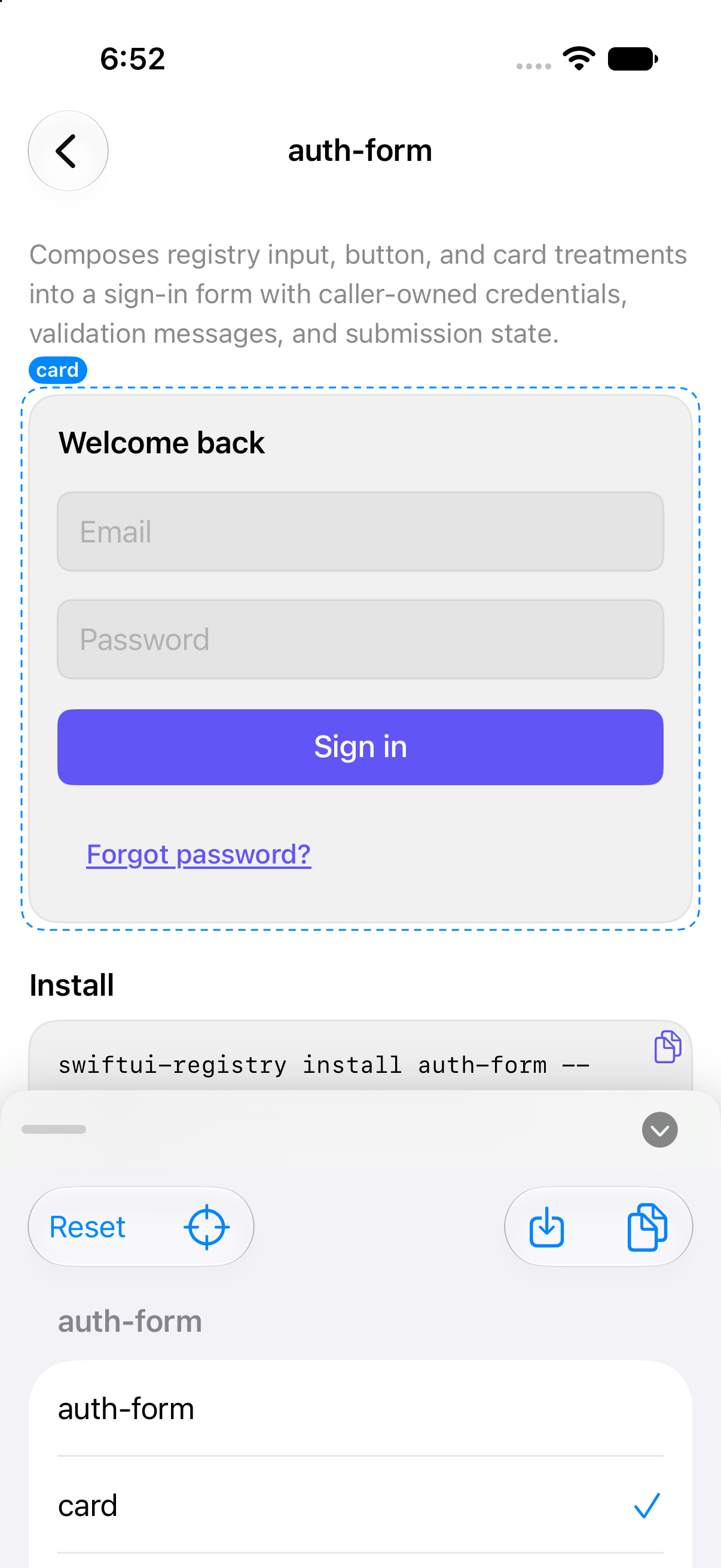
Tuning card, Showcase, iPhone, outlined
iPhone: stays where left.
Tuning panel, Showcase, iPad side column, buttons outlined
iPad: docks into a column.

You get

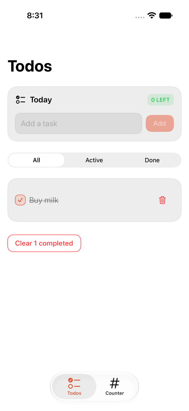
One todo-and-counter app, three UI layers, same reducers: registry, stock SwiftUI, handmade. Tested 2026-09-06, iPhone 17 simulator, iOS 27; see Examples/TodoCounter.
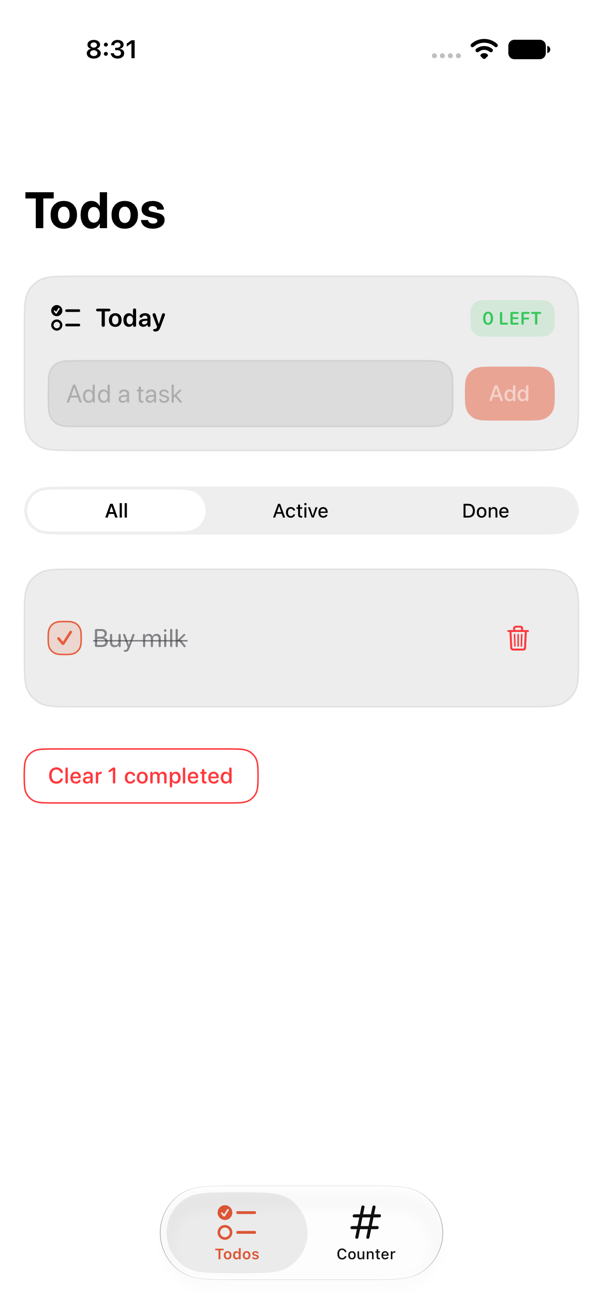
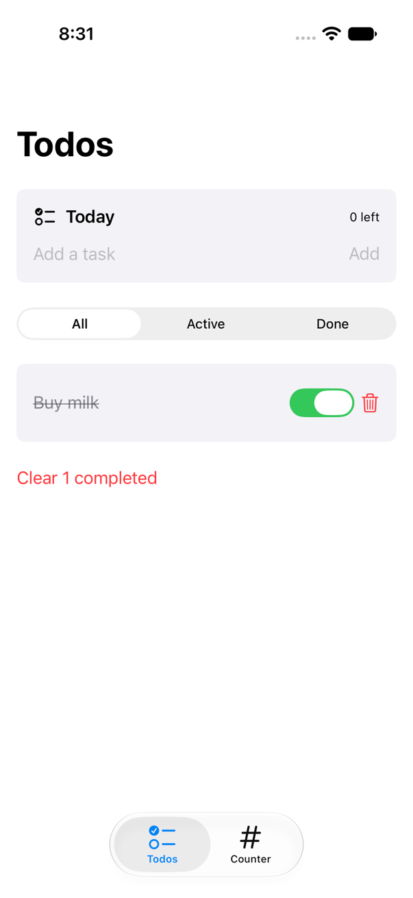
Todos on the registry layer
Registry
Todos on the stock layer
Stock
Todos on the handmade layer
Handmade
RegistryStockHandmade
Lines written223 (4 files)154 (3 files)585 (11 files)
Owned, not written651 (7 items)00
Protocols/modifiersnonenoneButtonStyle, TextFieldStyle (_body), GroupBoxStyle, ToggleStyle, 3 ViewModifiers, environment key, theme (8 colors, 9 metrics)
Lookcoral (preset)stock controlssame, byte-identical
Change accent everywhereone value (RegistryTheme+App.swift) or new preset codenot availableone value, once plumbed
Updates--update merges upstream, keeps editsnothing to updateby hand
Accessibility built inrequired icon-only labels, 44 pt hits, text-scaling boxes, VoiceOver switch, RTL/Dynamic Type previewswhatever stock givesknow it, rewrite it
App launch, XCTApplicationLaunchMetric, 5 runs2.97 s2.99 s2.98 s
5 tasks, complete, clear, XCTClockMetric, 3 runs9.17 s15.59 s9.16 s
SkillsSwiftUI basics, one commandSwiftUI basicsstyle protocols, environment plumbing, Dynamic Type, accessibility, dark-mode color, RTL

Runtime: registry vs handmade cost nothing extra, within noise. Stock's slower interaction: switch animation under UI automation, not rendering. Registry saves 585 lines and the skills, once per project, plus an update path.

Blocks and components

Installed source, rendered by Showcase, iPhone 17, iOS 27.
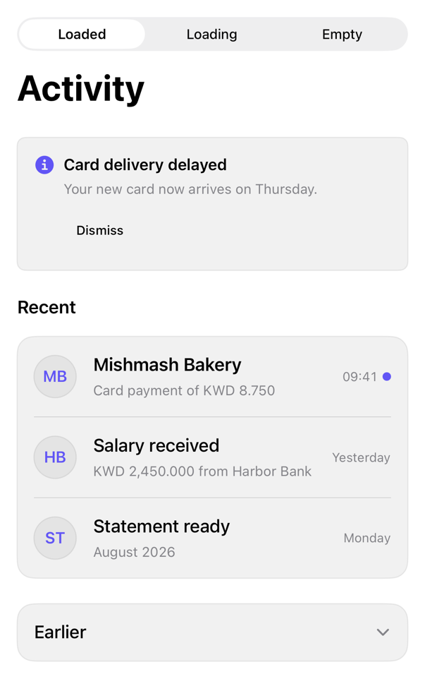
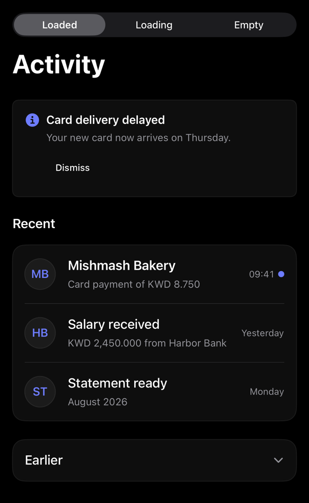
activity-feed preview
block
activity-feed
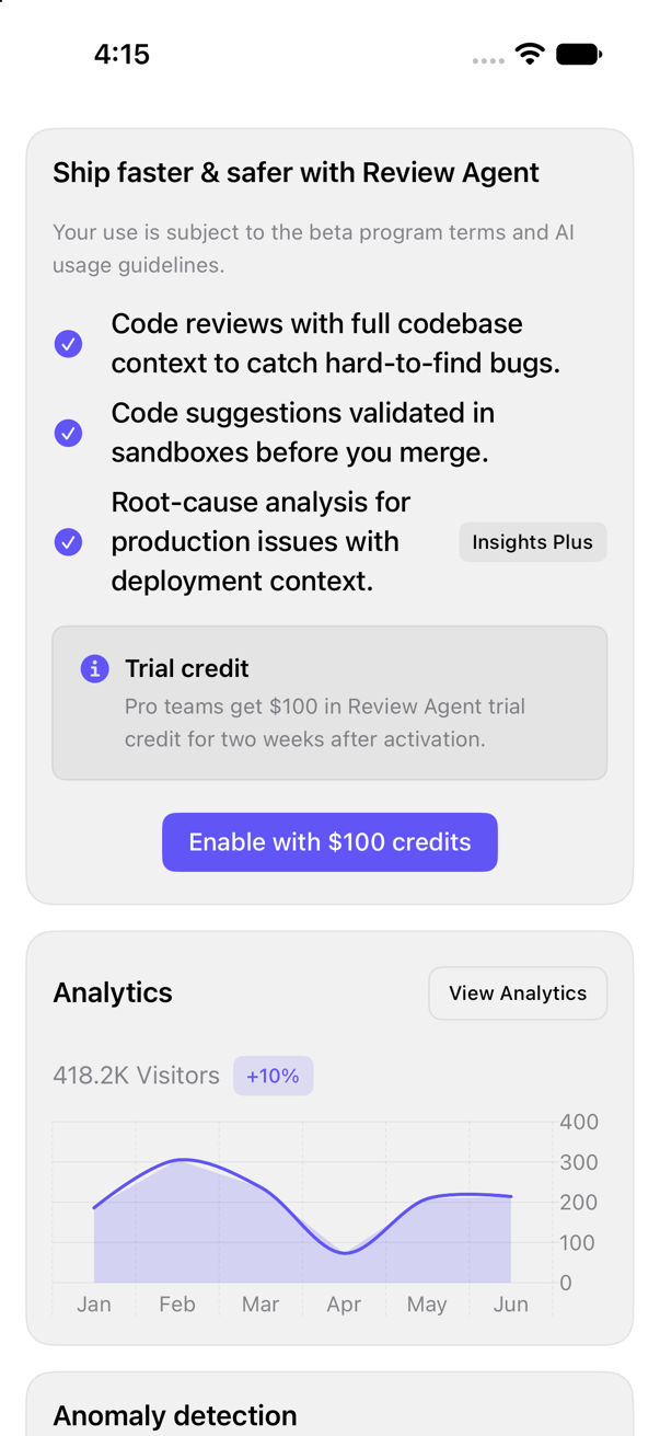
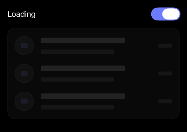
Composes alert, avatar, item, skeleton, empty, accordion; caller-owned loading, items, notice, selection.
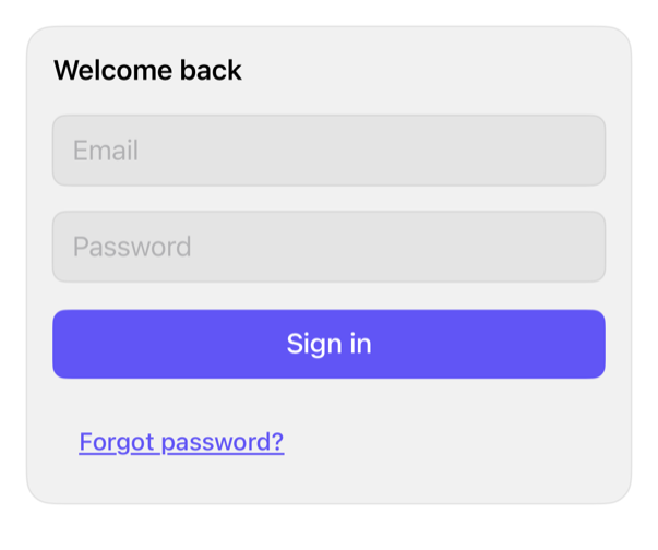
auth-form preview
block
auth-form
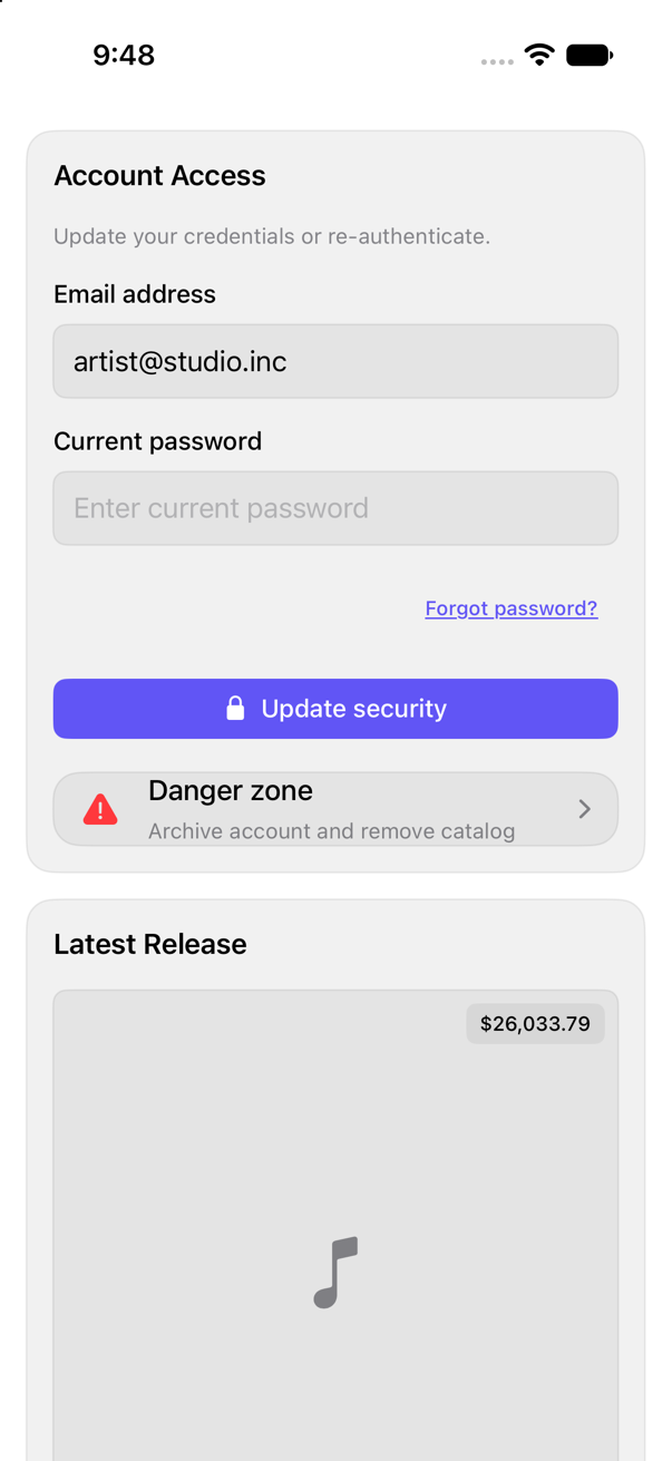
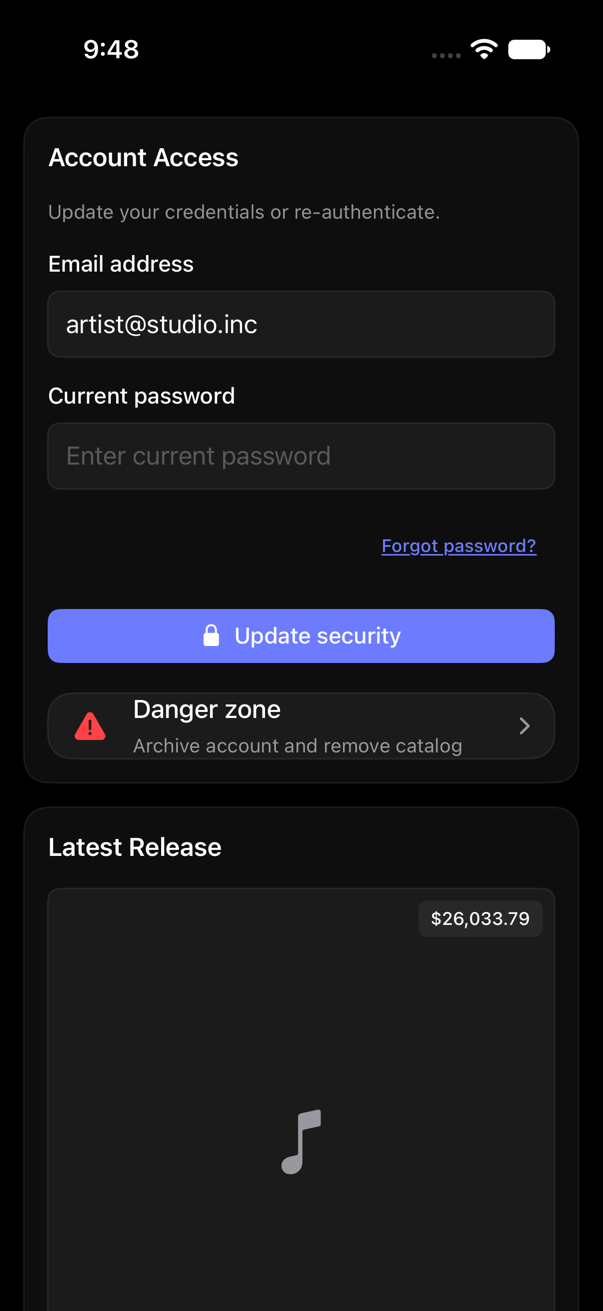
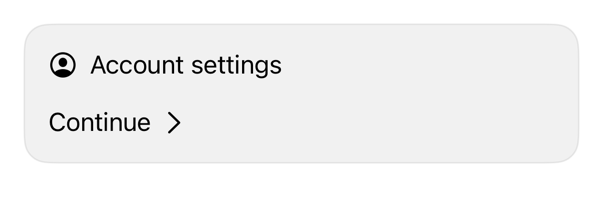
Composes input, button, card into sign-in form; caller owns credentials, validation, submission state.
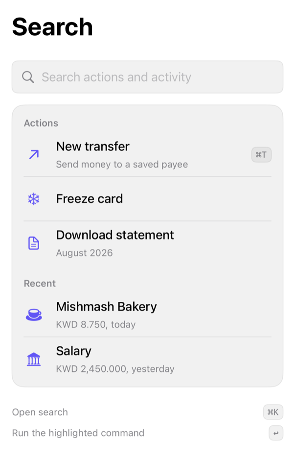
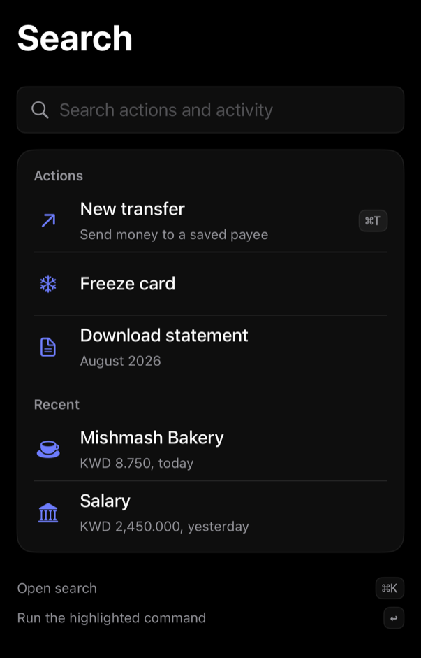
command-search preview
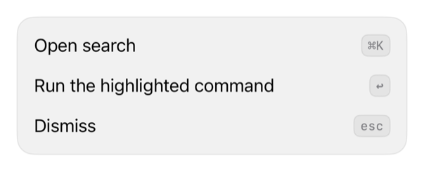
block
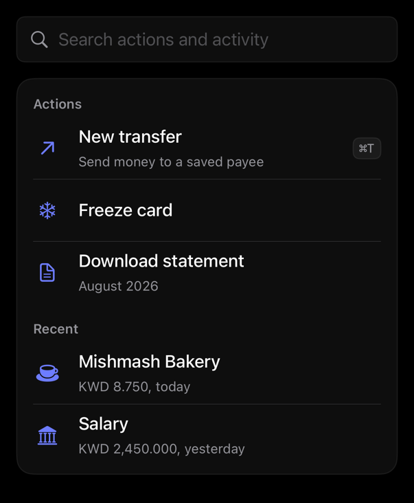
command-search
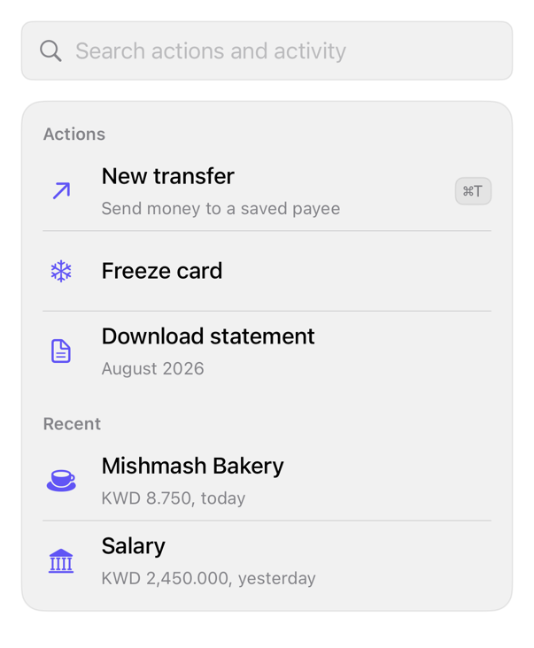
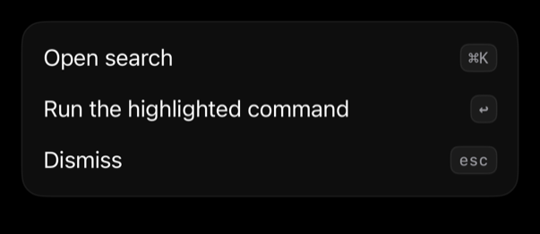
Composes command, keycap; caller owns query, filtering, sections, legend.
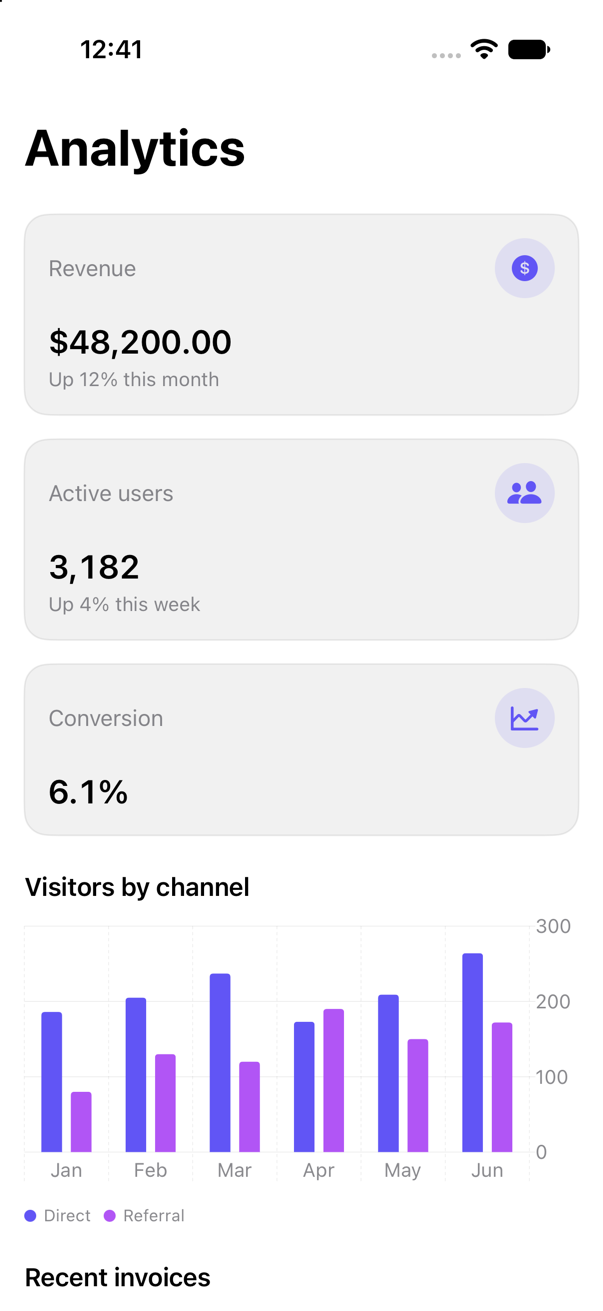
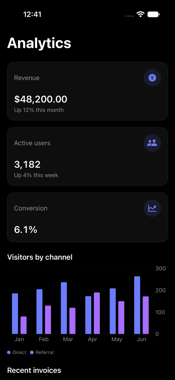
dashboard preview
block
dashboard
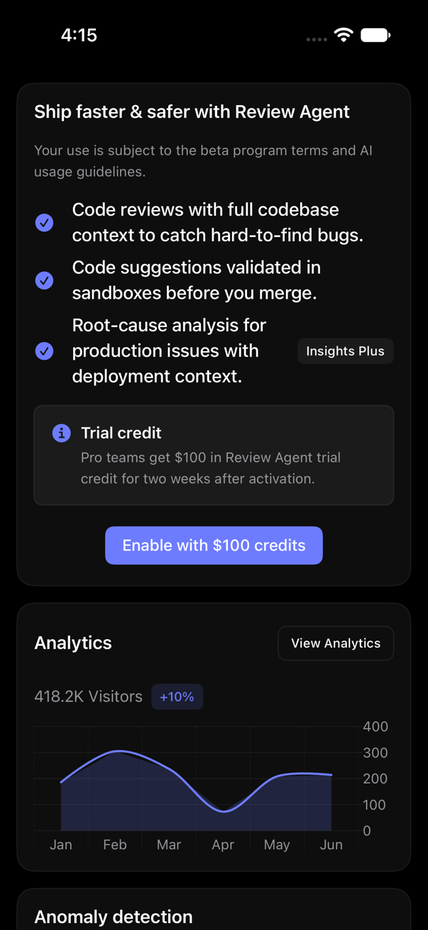
Composes metrics, bar chart, table; caller-owned values, selection.
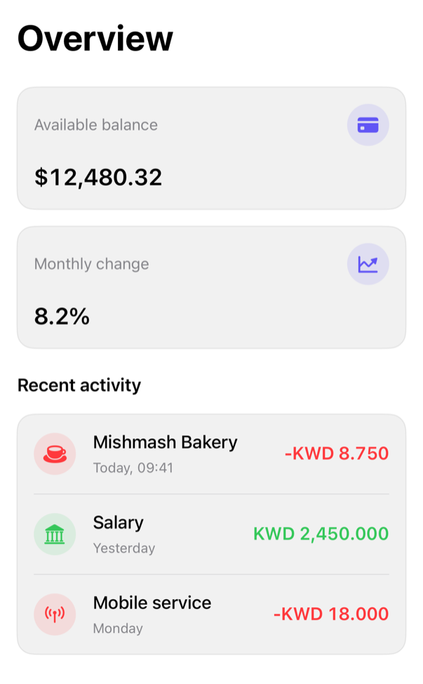
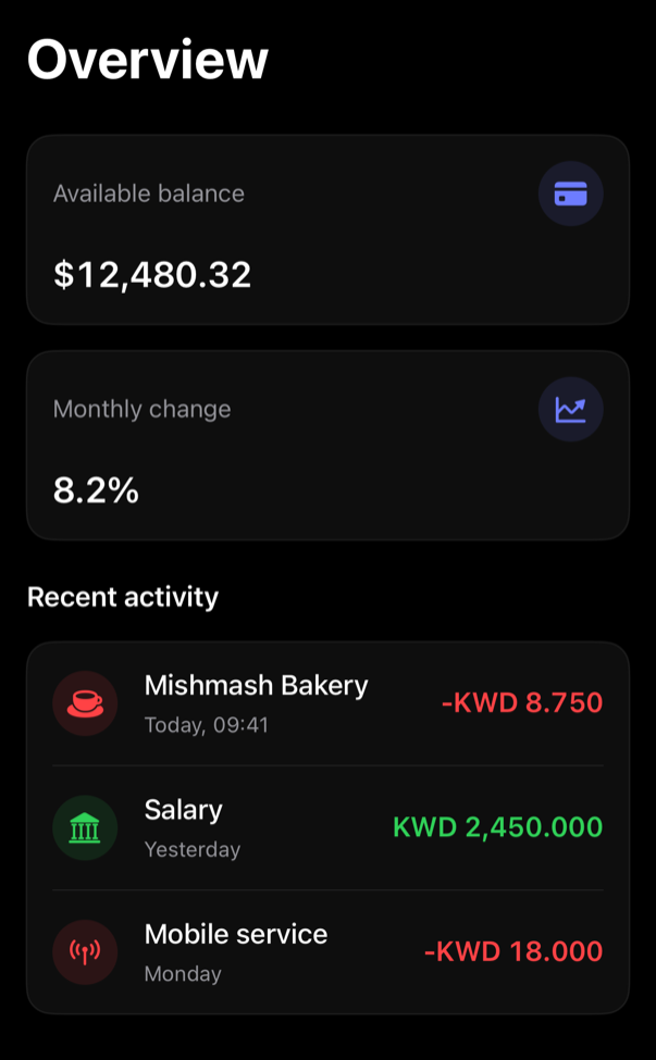
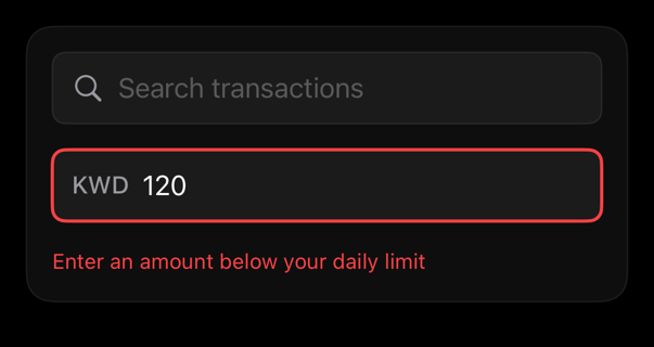
finance-overview preview
block
finance-overview
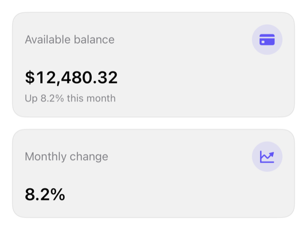
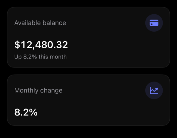
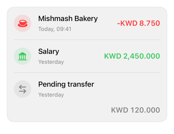
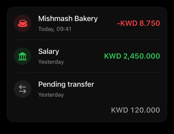
Composes metrics, selectable transactions; caller-owned navigation, state.
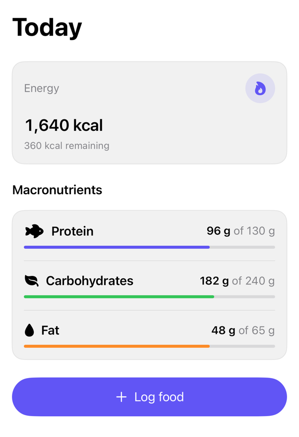
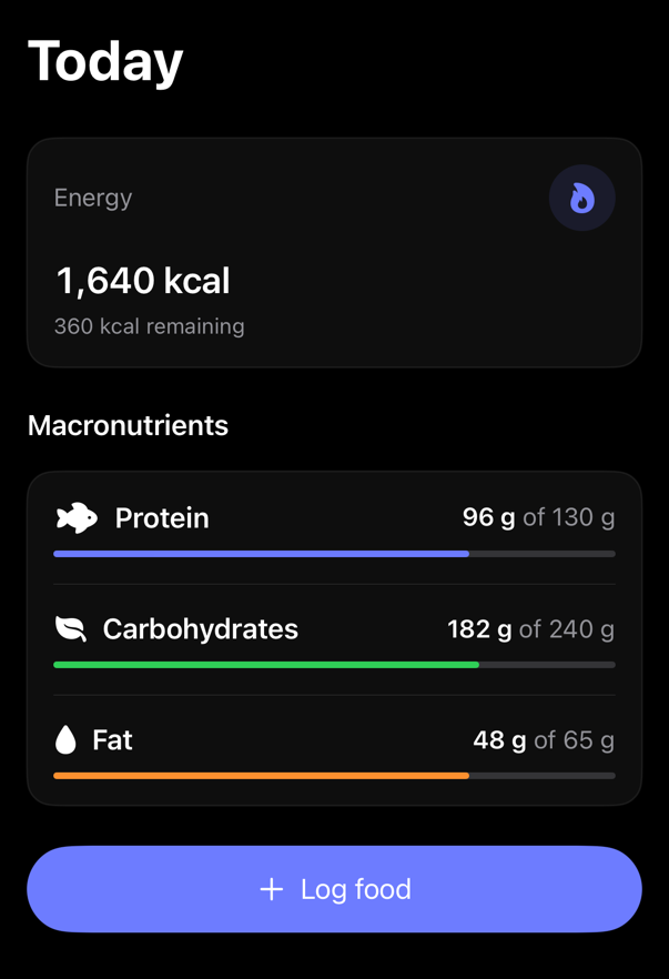
nutrition-overview preview
block
nutrition-overview
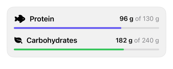
Composes energy, macro values; embeddable.
preview preview
block
preview
Theme wall: 33 cards, registry + native; adaptive grid, compact one-column.
preview-02 preview
block
preview-02
Theme wall: 35 cards, registry + native; adaptive grid, compact one-column.
questionnaire preview
block
questionnaire
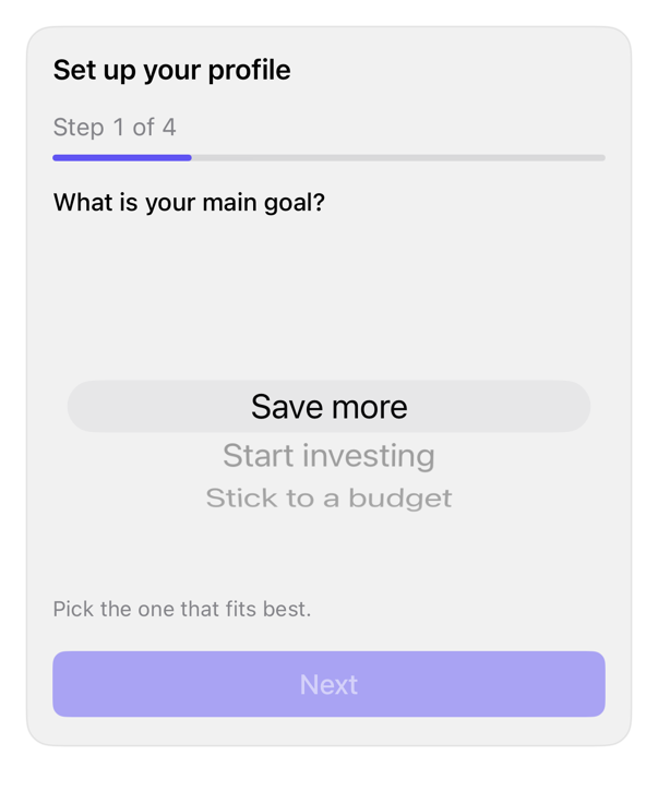
Composes field, checkbox, textarea, progress, button, card; drives choice, freeform, skippable steps.
settings-section preview
block
settings-section
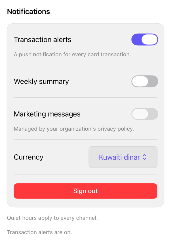
Composes select, separator, button; structure, separators, messages, caller-owned toggle/picker/action rows.
signup-form preview
block
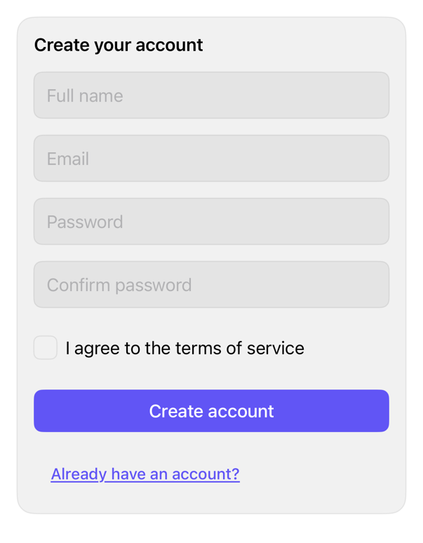
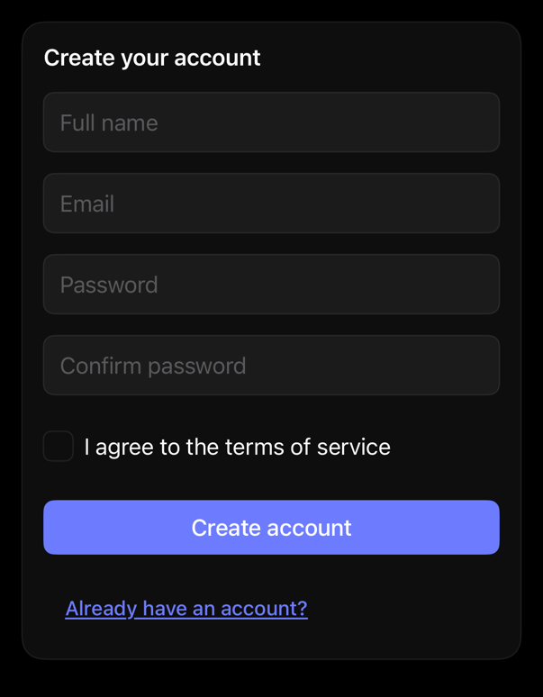
signup-form
Composes input, button, card, checkbox; caller owns fields, validation, terms, submission state.
accordion preview
component
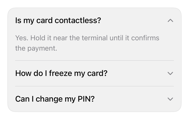
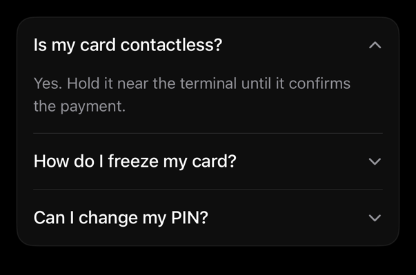
accordion
Styles DisclosureGroup: full-width header, trailing chevron; keeps caller styling.
alert preview
component
alert
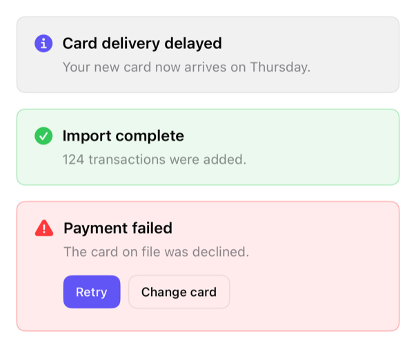
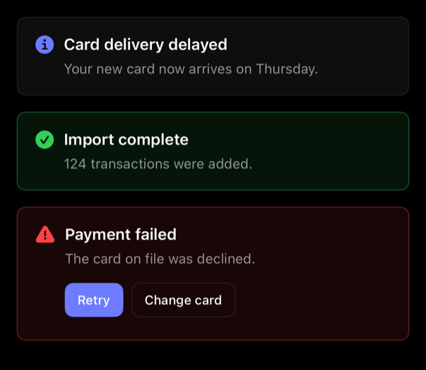
Inline alert: informational, positive, destructive; optional caller actions.
attachment preview
component
attachment
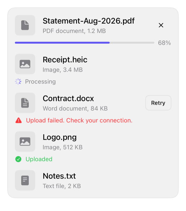
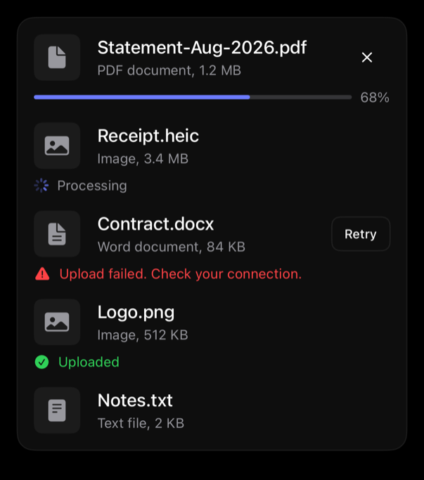
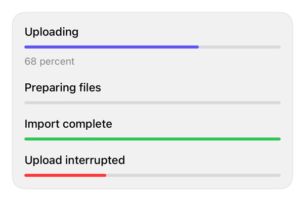
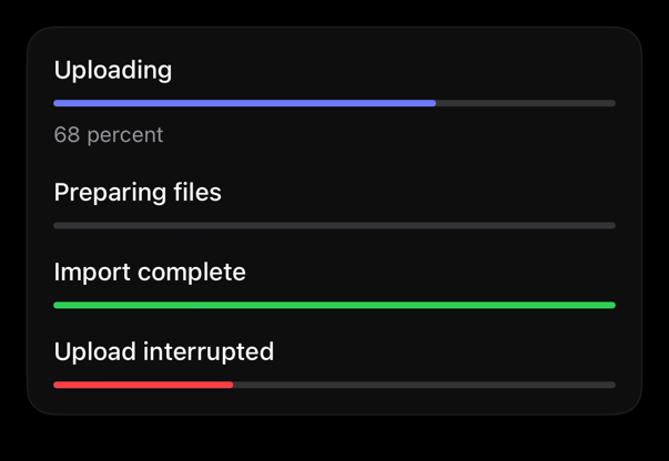
Row: square media, name, detail, caller actions. States: idle, uploading, processing, failed, completed.
avatar preview
component
avatar
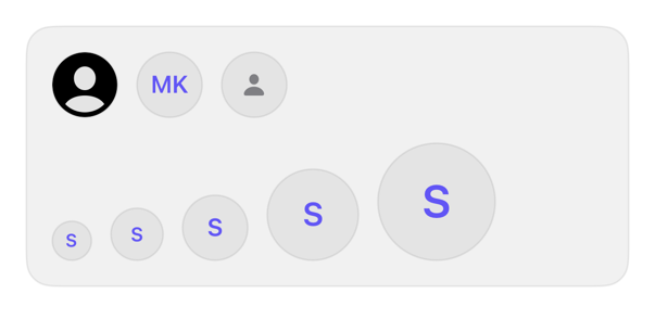
Identity image, circular; initials/symbol fallback. Sizes via controlSize; needs label.
badge preview
component
badge
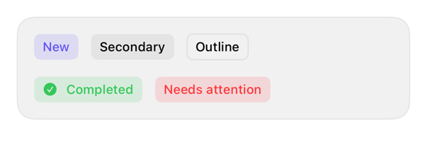
Primary, secondary, outline, positive, destructive: Text/Label treatments.
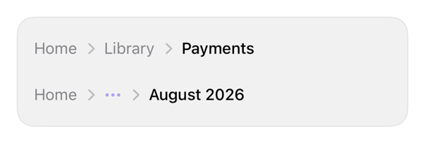
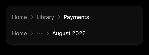
breadcrumb preview
component
breadcrumb
Horizontal nav trail: chevron separators, current page; overflow holds excess crumbs. iOS: no native breadcrumb.
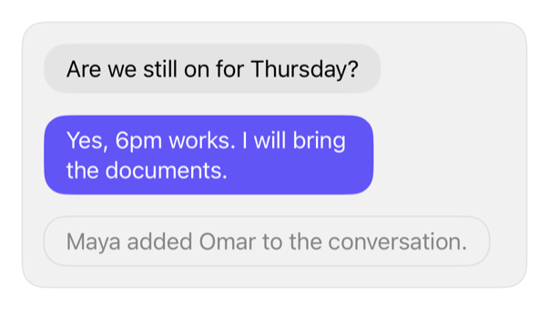
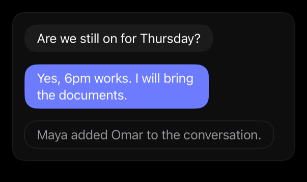
bubble preview
component
bubble
Wraps text: incoming, outgoing, muted; aligns with message row.
button preview
component
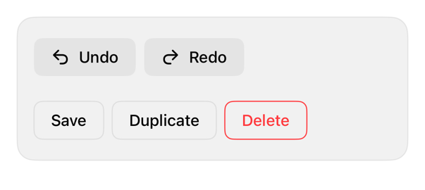
button
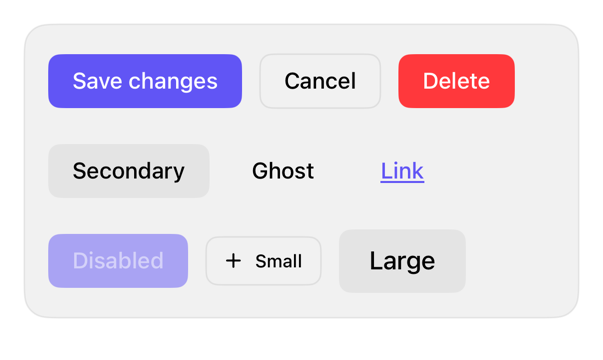
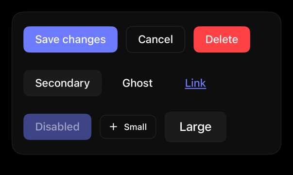
Styles SwiftUI buttons: shadcn-inspired variants; preserves roles, sizing.
button-group preview
component
button-group
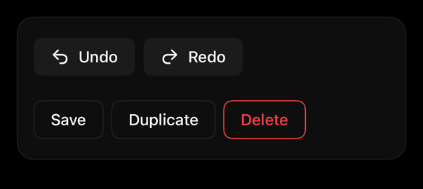
ControlGroup: buttons side by side, one variant; keeps roles, labels.
card preview
component
card
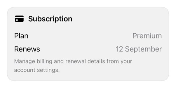
Styles GroupBox: bordered surface, adaptive label, content spacing.
chart preview
component
chart
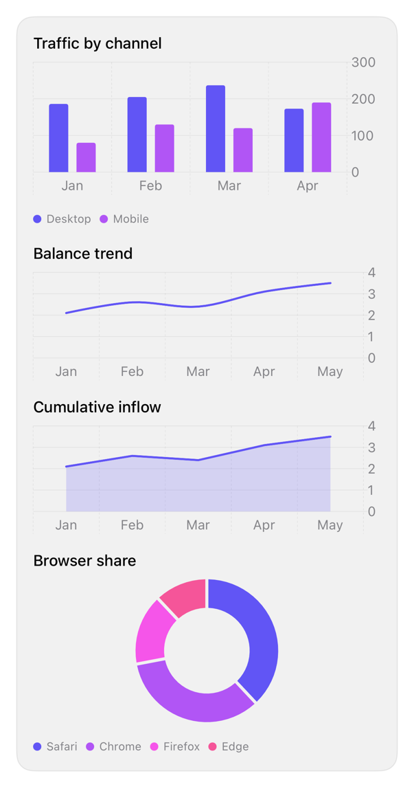
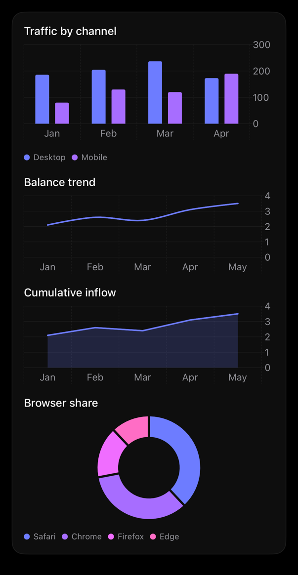
Styles Swift Charts to theme: accent palette, theme grid, footnote axis, legend; bar/line/area/pie.
checkbox preview
component
checkbox
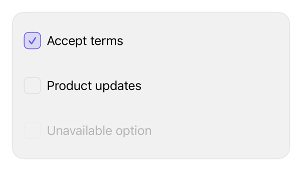
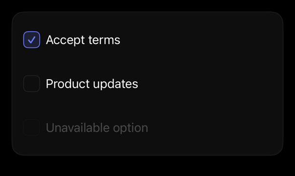
Styles Toggle as checkbox; preserves binding, label, state.
combobox preview
component
combobox
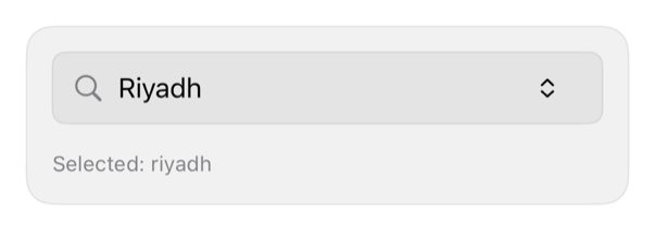
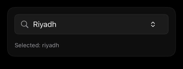
Searchable single-selection: search field, filtered list, binding-driven selection, native empty state.
command preview
component
command
Composes input group, rows, keycaps, empty state into search field.
empty preview
component
empty
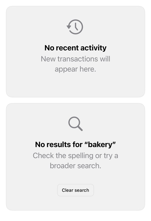
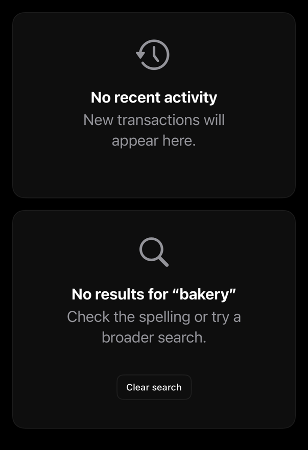
Places ContentUnavailableView on registry surface, where rows appear.
field preview
component
field
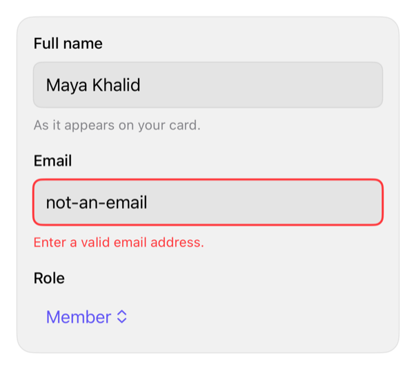
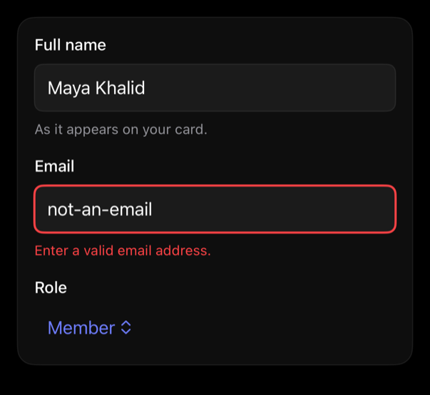
Labeled form field, native control; optional description; error drives invalid state.
input preview
component
input
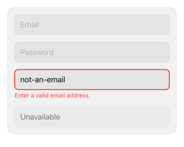
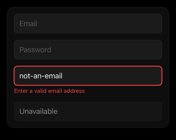
Styles TextField/SecureField: fill, focus, disabled, invalid.
input-group preview
component
input-group
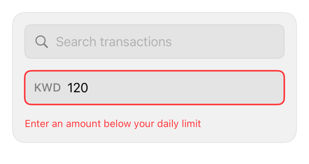
Wraps field in registry chrome; accessories add search symbol or clear button.
item preview
component
item
Composes content row: media, title, description, accessory; selection at call site.
kbd preview
component
kbd
Styles Text as a keycap for shortcuts.
label preview
component
label
Controls Label icon placement with semantic spacing.
macro-progress preview
component
macro-progress
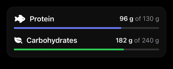
Nutrition progress via ProgressView.
marker preview
component
marker
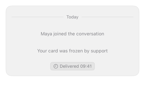
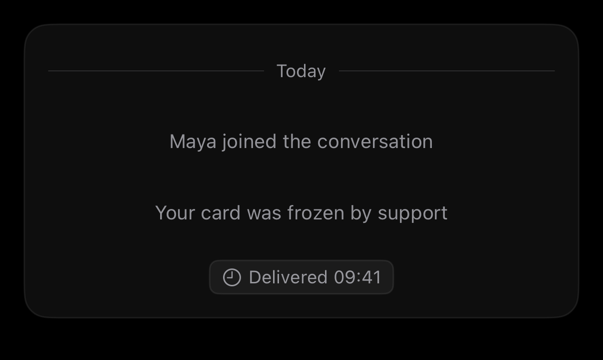
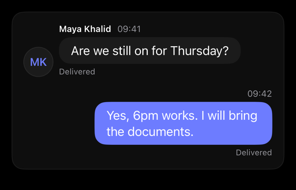
Marker style: note, status, separator variants (system line, delivery pill, date rule).
message preview
component
message
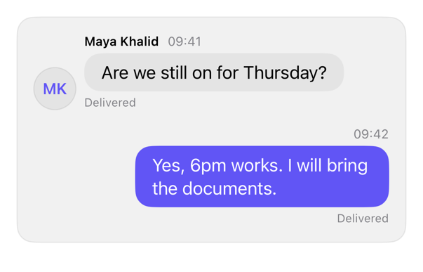
One turn: optional author/timestamp header, bubble content, status line, side alignment.
message-scroller preview
component
message-scroller
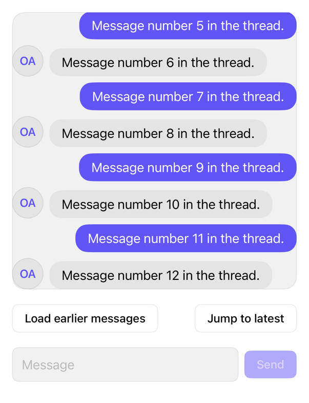
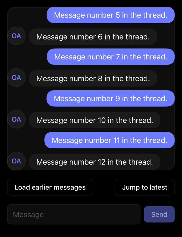
Chat ScrollView: newest-turn open, follows streamed replies, holds scrolled-up reader, requests history at top.
metric-card preview
component
metric-card
Formatted, semantic metric text.
progress preview
component
progress
Linear ProgressView: determinate, indeterminate, accent, positive, negative.
select preview
component
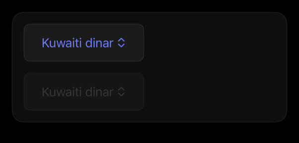
select
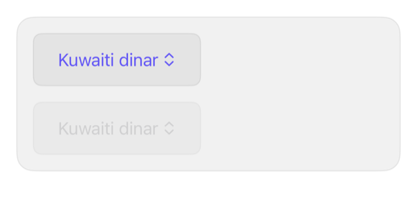
Adds chrome to menu-style Picker.
separator preview
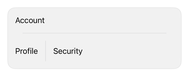
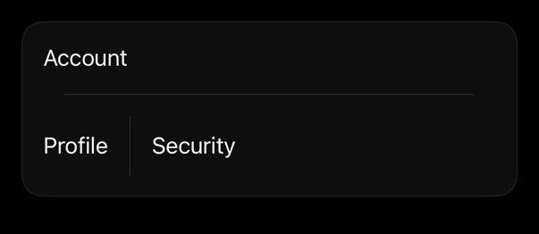
component
separator
Orientation, insets, native Divider.
skeleton preview
component
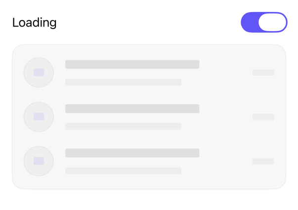
skeleton
Turns any view into loading placeholder with native redaction.
spinner preview
component
spinner
Compact circular indeterminate ProgressView style.
table preview
component
table
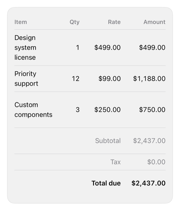
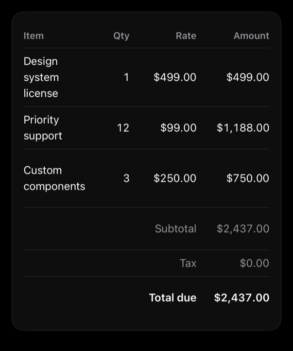
Identifiable rows in aligned columns; numeric monospaced; optional summary rows.
textarea preview
component
textarea
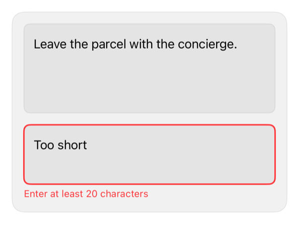
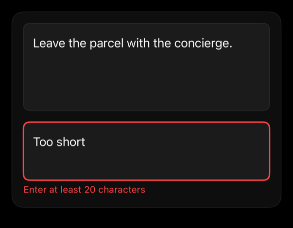
Focus, disabled, invalid chrome.
toast preview
component
toast
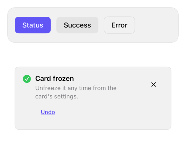
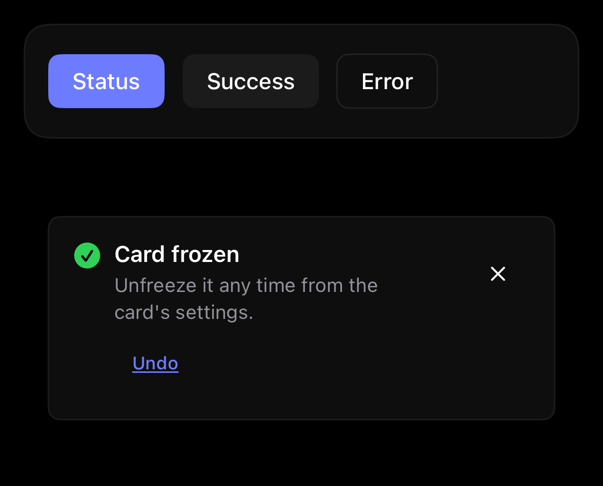
Transient status toast: informational, positive, destructive; optional action; swipe/tap/timed dismissal.
toggle preview
component
toggle
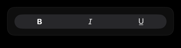
Button treatment, Toggle.
toggle-group preview
component
toggle-group
Toggle treatment, ControlGroup.
transaction-row preview
component
transaction-row
Transaction content; caller Button selects.
validated-input preview
component
validated-input
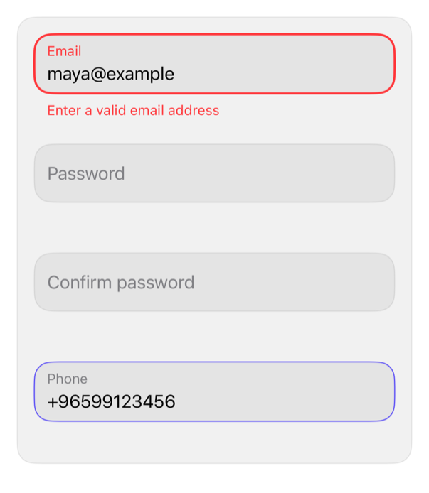
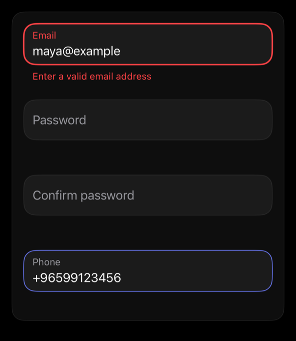
Text field with floating label, rounded border by focus and validity, rules checked while typing and on blur.

Recipes

When a one-line Apple API suffices, the registry says so, not wraps it.