component
item
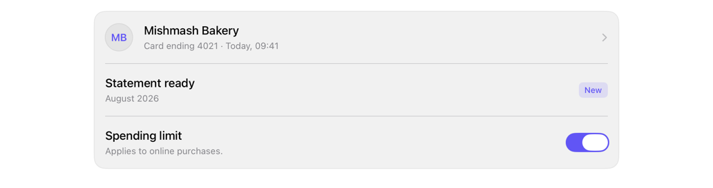
Composes content row: media, title, description, accessory; selection at call site.
itemrowlistcellmediashadcn
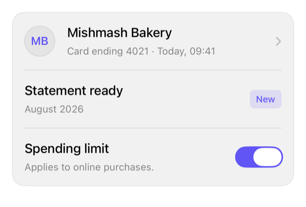
On iPad
The same installed source at a regular width. It adapts its layout without a separate design.
Install
With the sweetui tool (brew install mangobyte-dev/tap/sweetui):
sweetui install item --destination Sources/YourFeature/ComponentsInstalls in order: avatar 0.2.1, separator 0.2.1, badge 0.3.2, item 0.2.2. Point --destination at a folder inside the consuming target's sources.
Usage
ItemRow(
    title: Text("Statement ready"),
    description: Text("August 2026")
) {
    Avatar(initials: "ST", accessibilityLabel: Text("Statements"))
} accessory: {
    Text("New").registryBadge()
}

// Media only: the bare trailing closure is the media; name accessory: to add a trailing accessory.
ItemRow(title: Text("Mishmash Bakery"), description: Text("Card payment")) {
    Avatar(initials: "MB", accessibilityLabel: Text("Mishmash Bakery"))
}
Accessibility contract
- Title+description: one element; media/accessory separate, activatable.
- Selection: Button/NavigationLink, call site, combines row, label.
- Keeps 44-point min height, rectangular shape.
- System styles, spacing tokens; description wraps, not truncates.
- Switch: row in Toggle's label, spoken once. labelsHidden accessory MUST restore its label.
Details
| Kind | component |
| Version | 0.2.2 |
| Platforms | iOS 26.0+ |
| Dependencies | avatar, separator, badge |
| Source | Registry/sources/components/ItemRow.swift |
| Xcode preview | Item Row |