component
field
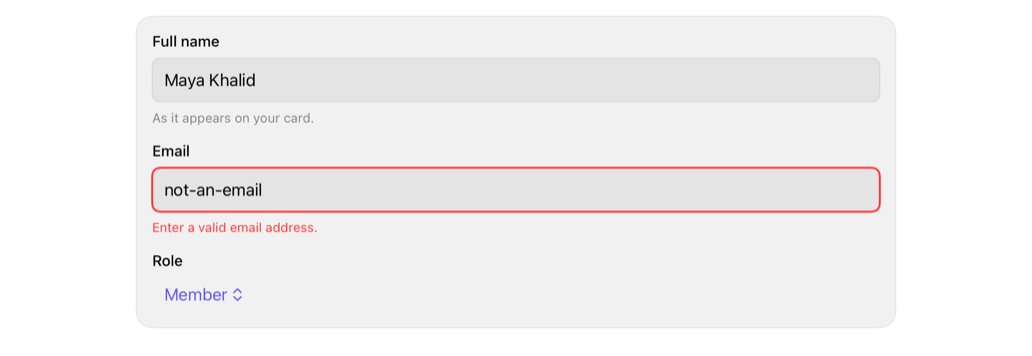
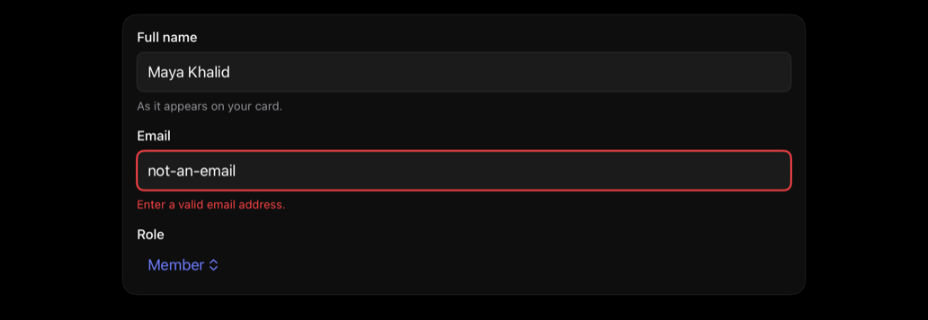
Labeled form field, native control; optional description; error drives invalid state.
fieldformlabelvalidationerrorshadcn
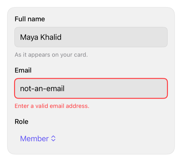
On iPad
The same installed source at a regular width. It adapts its layout without a separate design.
Install
With the sweetui tool (brew install mangobyte-dev/tap/sweetui):
sweetui install field --destination Sources/YourFeature/ComponentsInstalls in order: input 0.5.1, field 0.1.2. Point --destination at a folder inside the consuming target's sources.
Usage
@State private var name = ""
@State private var email = ""
@State private var phone = ""
@State private var showErrors = false
@State private var phoneError: String? = nil

FieldGroup {
    Field("Full name", description: "As it appears on your card.") { _ in
        TextField("Full name", text: $name)
            .textFieldStyle(.registryInput)
            .accessibilityLabel("Full name")
    }
    Field("Email", error: showErrors ? "Enter a valid email address." : nil) { isInvalid in
        TextField("you@example.com", text: $email)
            .textFieldStyle(RegistryInputStyle(isInvalid: isInvalid))
            .accessibilityLabel("Email")
    }
    Field("Phone", error: phoneError) { isInvalid in
        TextField("Phone", text: $phone)
            .textFieldStyle(RegistryInputStyle(isInvalid: isInvalid))
            .accessibilityLabel("Phone")
    }
}
Accessibility contract
- Builder gets invalid state, e.g. RegistryInputStyle(isInvalid:); MUST NOT fake it otherwise.
- Label doesn't auto-associate; MUST have accessibilityLabel matching visible label.
- Error/description becomes hint; focused control re-reads; new error announces.
- System styles, spacing tokens; label/description/error wrap.
Details
| Kind | component |
| Version | 0.1.2 |
| Platforms | iOS 26.0+ |
| Dependencies | input |
| Source | Registry/sources/components/Field.swift |
| Xcode preview | Field |