Search items
Jump to an item
Themes
One modifier, every screen
RegistryTheme: optional accent, label color, surface, hairline border, positive/negative, disabled opacity, metrics. Apply once via .registryTheme(_:) at root; items read tokens from the environment, controls follow tint.
Presets
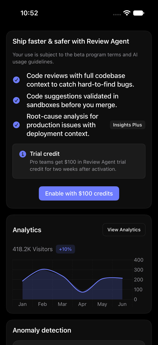
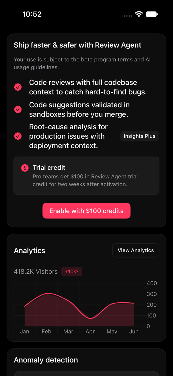
Starting points, each a plain static let to copy/edit. Cards: first screen of the preview wall ( preview block, 33 cards), iPhone 17.
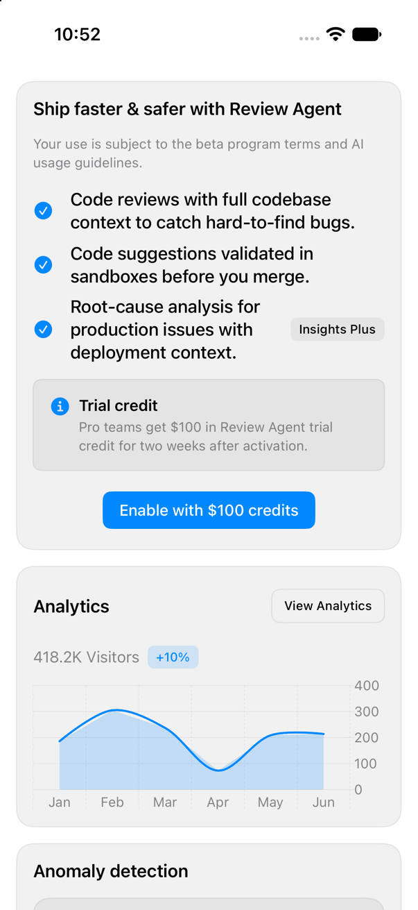
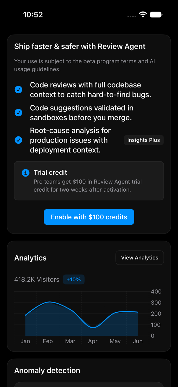
ContentView()
    .registryTheme(.system)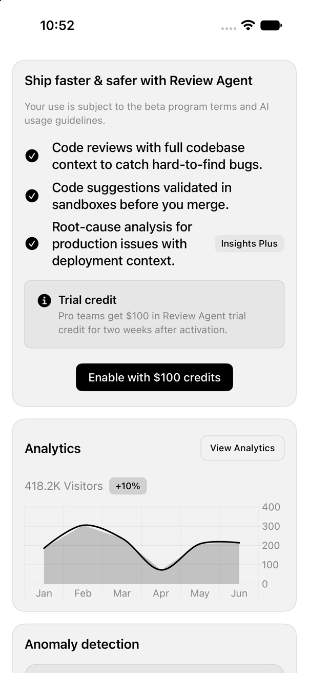
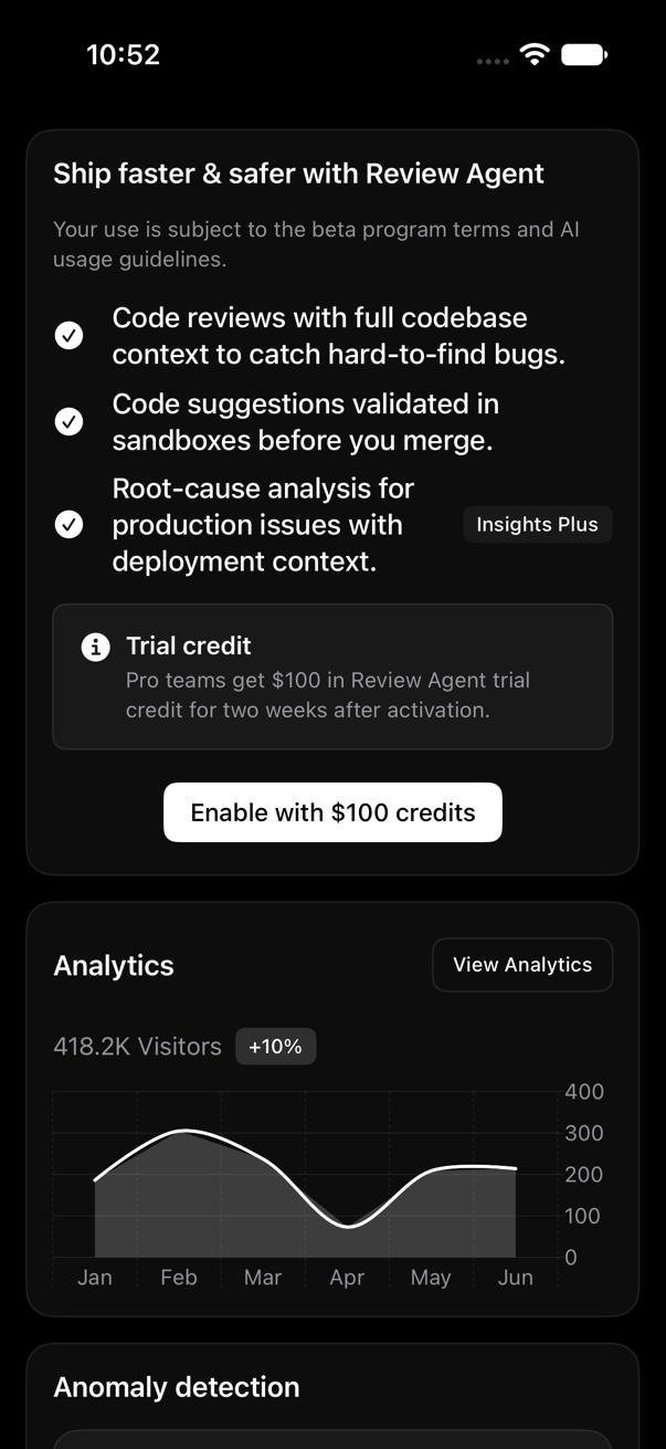
ContentView()
    .registryTheme(.graphite)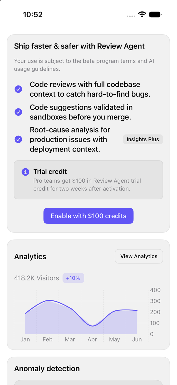
ContentView()
    .registryTheme(.indigo)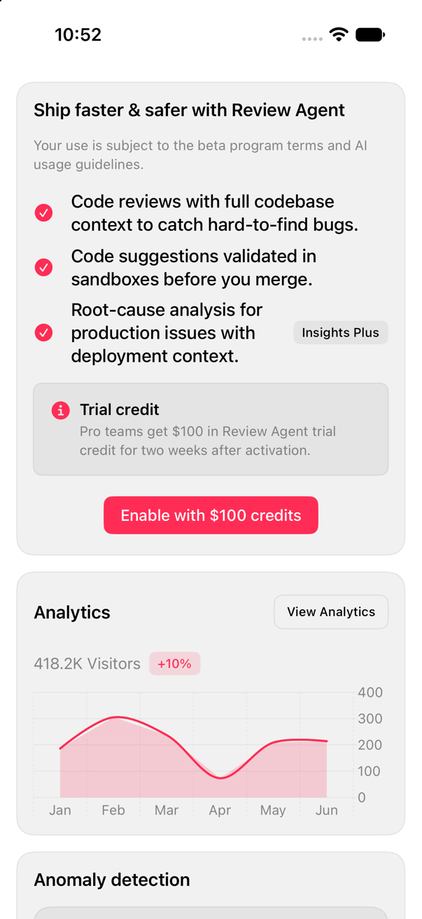
ContentView()
    .registryTheme(.rose)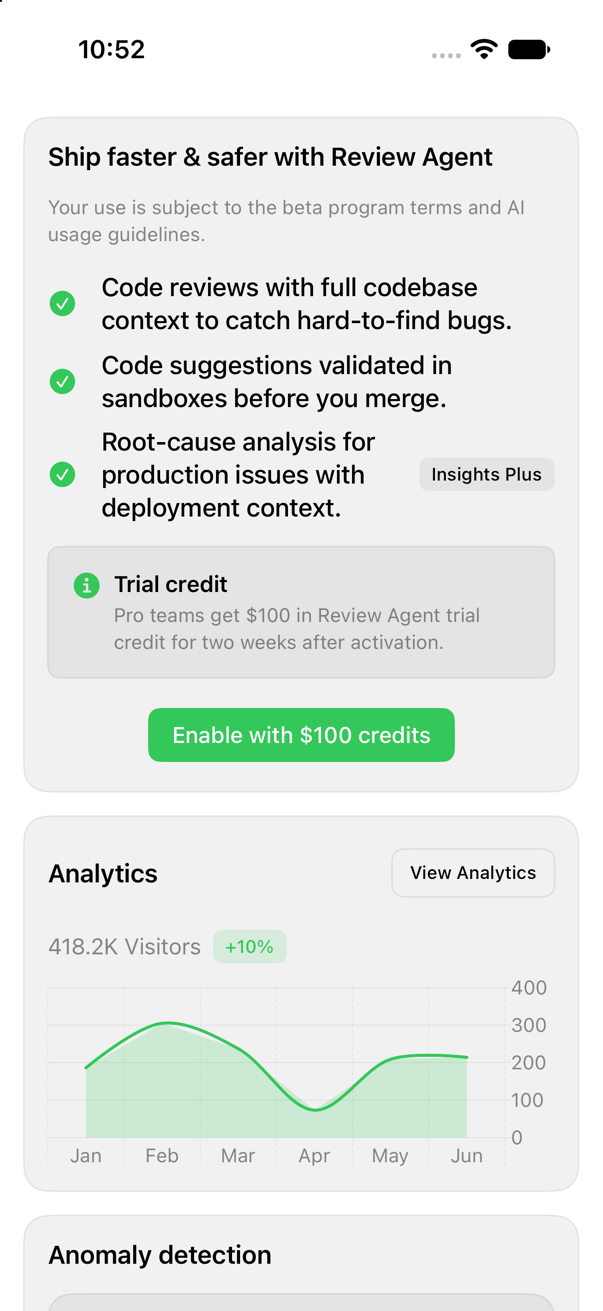
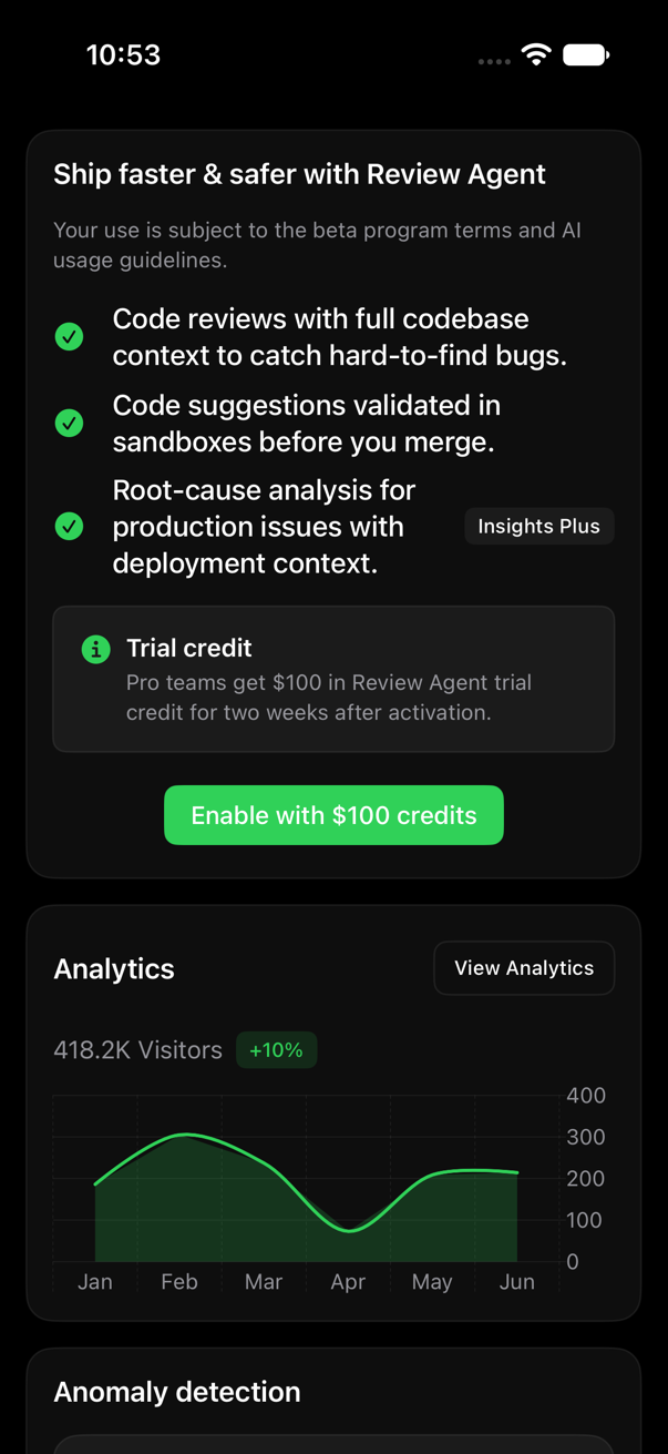
ContentView()
    .registryTheme(.emerald)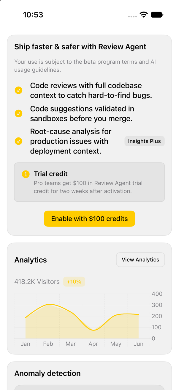
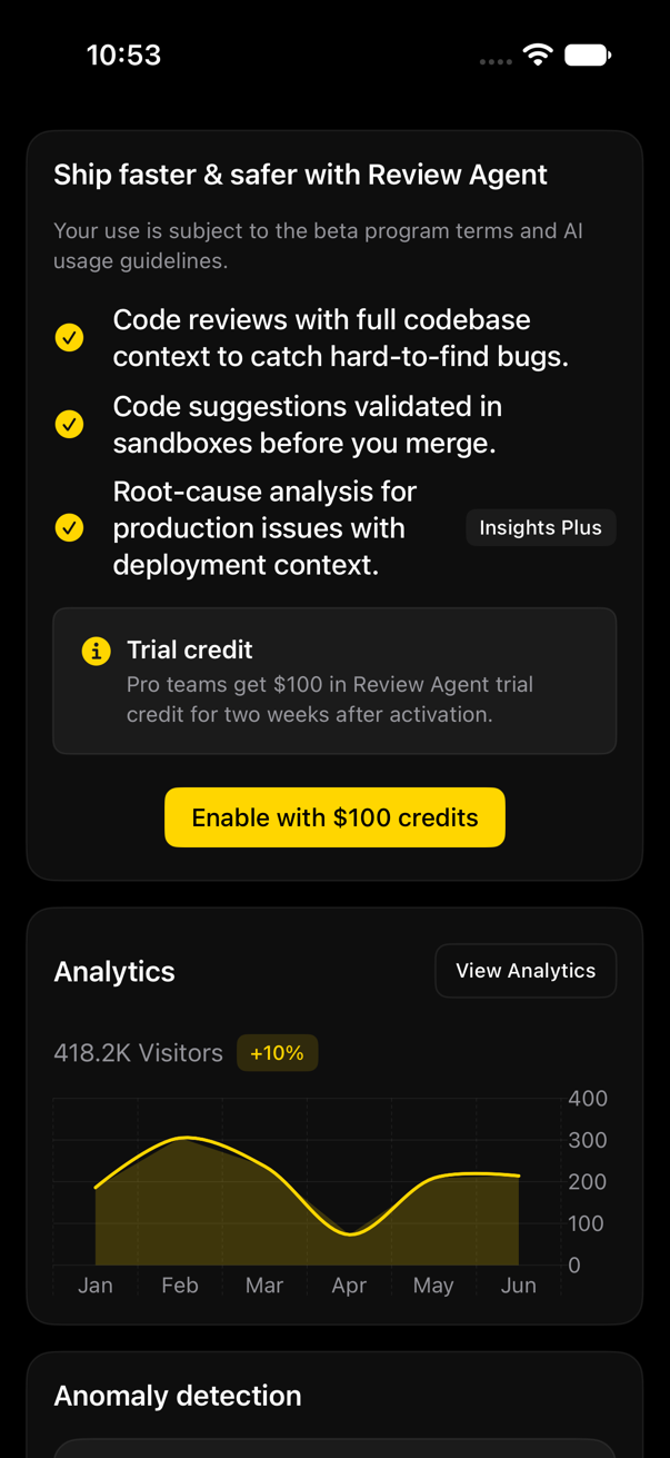
ContentView()
    .registryTheme(.amber)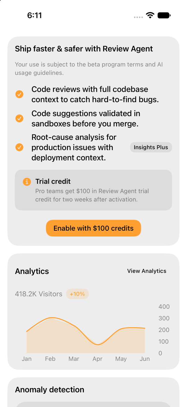
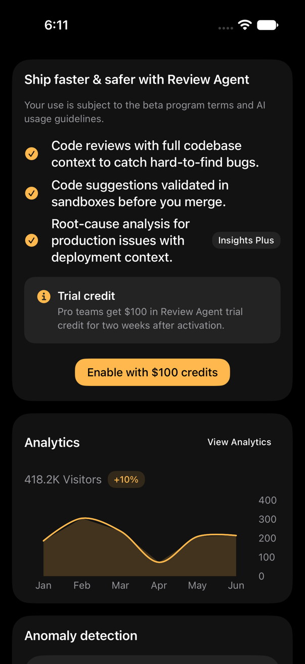
ContentView()
    .registryTheme(.mango)
MANGO, a design system built on the registry
A worked brand example, a template to build your own.
MANGO: rounded type via .fontDesign(.rounded), strokeless surfaces (zero border opacity, depth from surface step), one accent, two owned/edited items, critically-damped button press, tabular metric-card digits, preset .mango. Code opens it in Create as a template.
ContentView()
    .registryTheme(.mango)
    .fontDesign(.rounded)
sweetui preset apply a74hGF01CVunaG0vzZJG --destination Sources/YourFeature/Components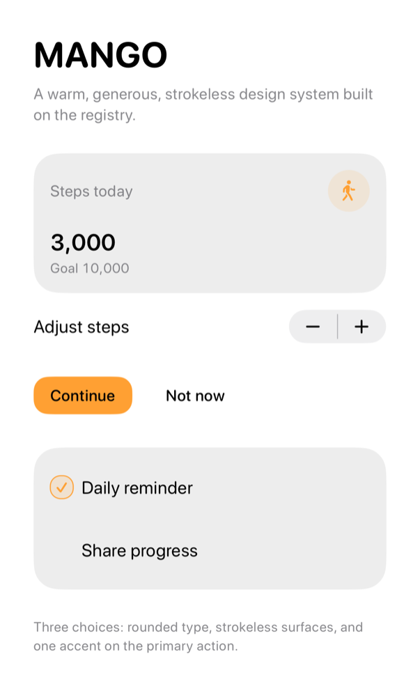
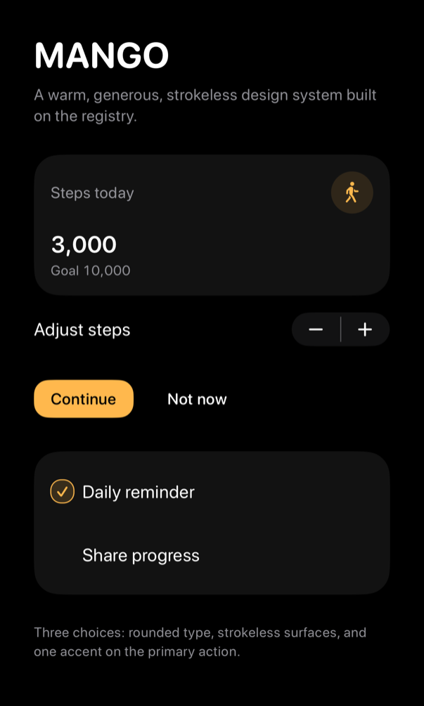
Tune it live
The Showcase's tuning panel is the theme creator, beside the catalog.
Every token: a slider or swatch beside live preview: accent, label color, surface/border opacity, border widths, 3 radii, 4 spacings, disabled opacity. Appearance, text size, RTL check result. Copy Swift puts the exact initializer on pasteboard; Copy Code puts the preset code instead:
let theme = RegistryTheme(
    accent: .primary,
    onAccent: Color(uiColor: .systemBackground),
    surface: .primary.opacity(0.050),
    border: .primary.opacity(0.100),
    disabledOpacity: 0.500,
    metrics: RegistryMetrics(
        compactSpacing: 8,
        standardSpacing: 16,
        sectionSpacing: 24,
        controlHorizontalPadding: 12,
        borderWidth: 1,
        emphasizedBorderWidth: 2,
        compactRadius: 6,
        controlRadius: 10,
        cardRadius: 18
    )
)

// Apply once at the root of your scene; every registry item below inherits it.
ContentView()
    .registryTheme(theme)
Open Examples/Showcase/SweetUIShowcase.xcworkspace, run Showcase, tap Tune above the tab bar. Panel: inspector on iPad, sheet on iPhone (catalog interactive beneath). Demos update live. Copy Code puts a preset code on pasteboard; Create page and sweetui preset read it. Captures: preview wall's first screen ( preview block, 33 cards), iPhone 17.
Every token
| Token | Default | Read by |
|---|---|---|
accent | nil (app tint) | tinted items, via subtree tint |
onAccent | .white | button, auth-form |
surface | .primary.opacity(0.055) | card, input, badge, select, textarea, avatar, alert, empty, blocks |
border | .primary.opacity(0.08) | card, input, badge, separator, select, textarea, checkbox, accordion |
positive | .green | badge, progress, transaction-row, alert |
negative | .red | badge, button, input, textarea, transaction-row, alert, auth-form |
disabledOpacity | 0.5 | button, checkbox, input, select, textarea |
metrics.compactSpacing | 8 | badge, label, rows |
metrics.standardSpacing | 16 | card, metric-card, blocks |
metrics.sectionSpacing | 24 | blocks |
metrics.controlHorizontalPadding | 12 | input, select |
metrics.borderWidth / emphasizedBorderWidth | 1 / 2 | inputs at rest, focused, or invalid |
metrics.compactRadius / controlRadius / cardRadius | 6 / 8 / 16 | badge/checkbox, controls/alerts, cards |
fontDesign | nil (system) | every text, via registryTheme's .fontDesign when set |
surfaceStep | 0.02 | elevation ladder, registrySurface(level:), RegistrySurfaceLevel |
chartPalette | .accent | chart, via chartForegroundStyleScale |
background | nil (system background) | scene root, when set |
foreground | nil (system label) | scene root; secondary hierarchy derives from it |
secondaryForeground | nil (system secondary label) | scene root, paired with foreground when set |