component
table
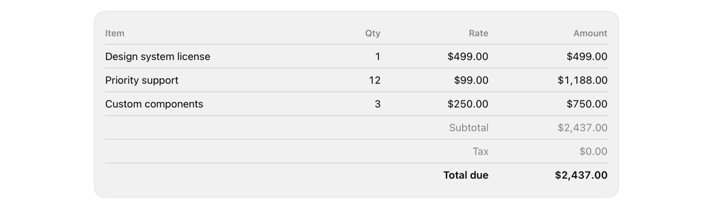
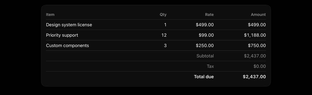
Identifiable rows in aligned columns; numeric monospaced; optional summary rows.
tablegriddatarowscolumnsshadcn
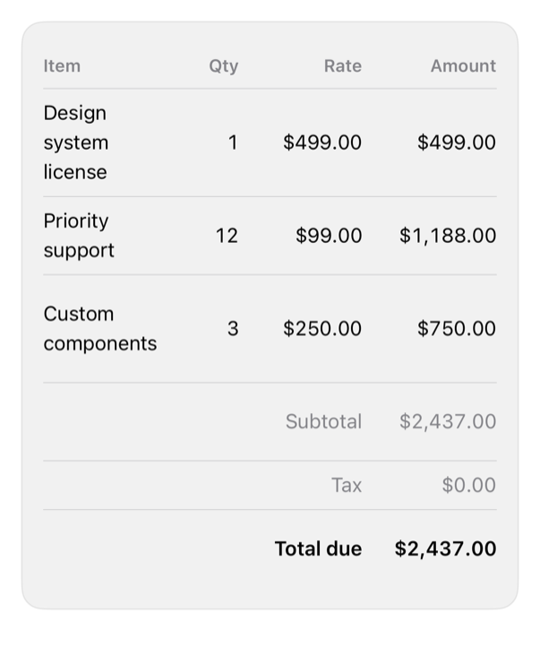
On iPad
The same installed source at a regular width. It adapts its layout without a separate design.
Install
With the sweetui tool (brew install mangobyte-dev/tap/sweetui):
sweetui install table --destination Sources/YourFeature/ComponentsInstalls in order: separator 0.2.1, table 0.1.1. Point --destination at a folder inside the consuming target's sources.
Usage
DataTable(
    lines,
    columns: [
        DataTableColumn(Text("Item")) { Text($0.item) },
        DataTableColumn(Text("Qty"), alignment: .trailing) { Text($0.quantity, format: .number) },
        DataTableColumn(Text("Amount"), alignment: .trailing) { Text($0.amount, format: .currency(code: "USD")) }
    ],
    footer: [
        DataTableFooterRow(label: Text("Total due"), value: Text(total, format: .currency(code: "USD")), isEmphasized: true)
    ]
)
Accessibility contract
- Row combines into one element; header row carries trait.
- Trailing columns hold numbers, hug edge; figures align.
- Grid, not Table (single column on iPhone); leading column takes remaining width.
- System text styles, semantic spacing, theme separators; cells wrap not truncate.
Details
| Kind | component |
| Version | 0.1.1 |
| Platforms | iOS 26.0+ |
| Dependencies | separator |
| Source | Registry/sources/components/DataTable.swift |
| Xcode preview | Data Table |