component
validated-input
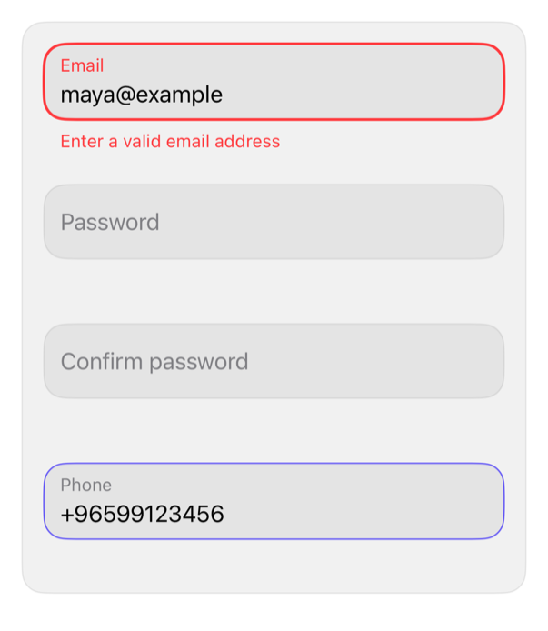
Text field with floating label, rounded border by focus and validity, rules checked while typing and on blur.
inputvalidationtext-fieldformfloating-label
Install
With the sweetui tool (brew install mangobyte-dev/tap/sweetui):
sweetui install validated-input --destination Sources/YourFeature/ComponentsInstalls in order: validated-input 0.1.0. Point --destination at a folder inside the consuming target's sources.
Usage
@State private var email = ""
@State private var password = ""
@State private var confirmation = ""
@State private var phone = ""
@State private var emailValidity: InputValidity = .empty

ValidatedInput("Email", text: $email, validations: [.required, .email], validity: $emailValidity)
    .keyboardType(.emailAddress)
    .textInputAutocapitalization(.never)

ValidatedInput("Password", text: $password, validations: [.required, .password()], isSecure: true)

ValidatedInput("Confirm password", text: $confirmation, validations: [.required, .matching(password)], isSecure: true)

ValidatedInput("Phone", text: $phone, validations: [.required, .internationalPhone])
    .keyboardType(.phonePad)
Accessibility contract
- Label is the field's accessibilityLabel; the floating label is hidden from VoiceOver.
- Error becomes the hint and is announced when it appears.
- Focus and error change the border; error pairs color with the message text, never color alone.
- The label rises inside the field and a field with rules reserves its message line, so focus and errors never move neighboring views.
- Grows with Dynamic Type; no fixed heights; Reduce Motion drops the label animation.
- Inherits layout direction and tint; disabled state dims to the theme's disabledOpacity.
Details
| Kind | component |
| Version | 0.1.0 |
| Platforms | iOS 26.0+ |
| Dependencies | none |
| Source | Registry/sources/components/ValidatedInput.swift |
| Xcode preview | Validated Input |