recipe
alert-dialog
Modal .alert decision.
alertdialogconfirmdestructivemodalguidance
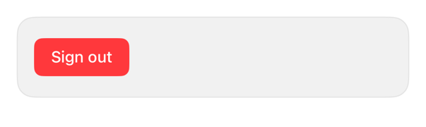
On iPad
The same installed source at a regular width. It adapts its layout without a separate design.


Install
Nothing to install
Copy the snippet below. The native API is the whole treatment.
Usage
@State private var isConfirmingSignOut = false

Button("Sign out", role: .destructive) {
    isConfirmingSignOut = true
}
.alert("Sign out?", isPresented: $isConfirmingSignOut) {
    Button("Sign out", role: .destructive) { }
    Button("Cancel", role: .cancel) { }
} message: {
    Text("You will need your password to sign in again.")
}
.registryItem("alert-dialog")
Why native is enough
Native .alert; .destructive irreversible, .cancel dismiss. Owns layout, typography, blur, VoiceOver focus; no wrapper.
Accessibility contract
- Alerts move VoiceOver focus, restore on dismiss.
- Roles drive destructive tint, cancel-position; no custom-styling.
- Copy MUST state consequence; MUST NOT rely on tint.
Details
| Kind | recipe |
| Version | 0.1.1 |
| Platforms | iOS 26.0+ |
| Dependencies | none |
| Source | none (native guidance) |