component
chart
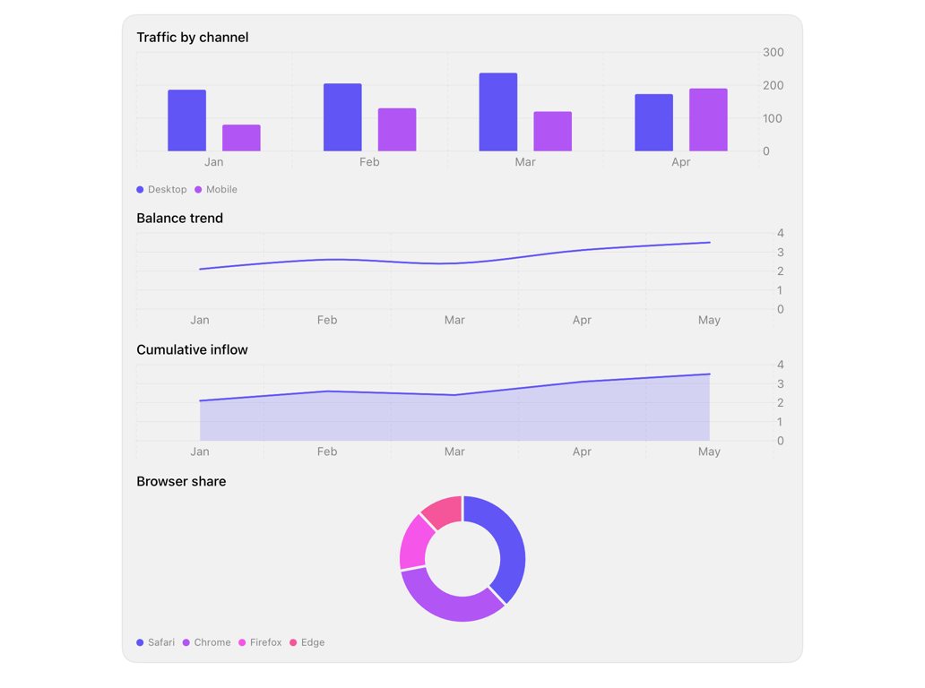
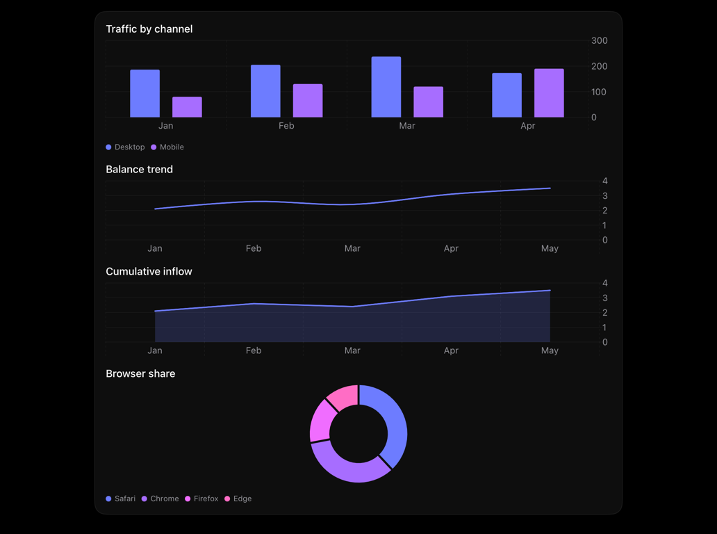
Styles Swift Charts to theme: accent palette, theme grid, footnote axis, legend; bar/line/area/pie.
chartchartsgraphbarlinepieshadcn
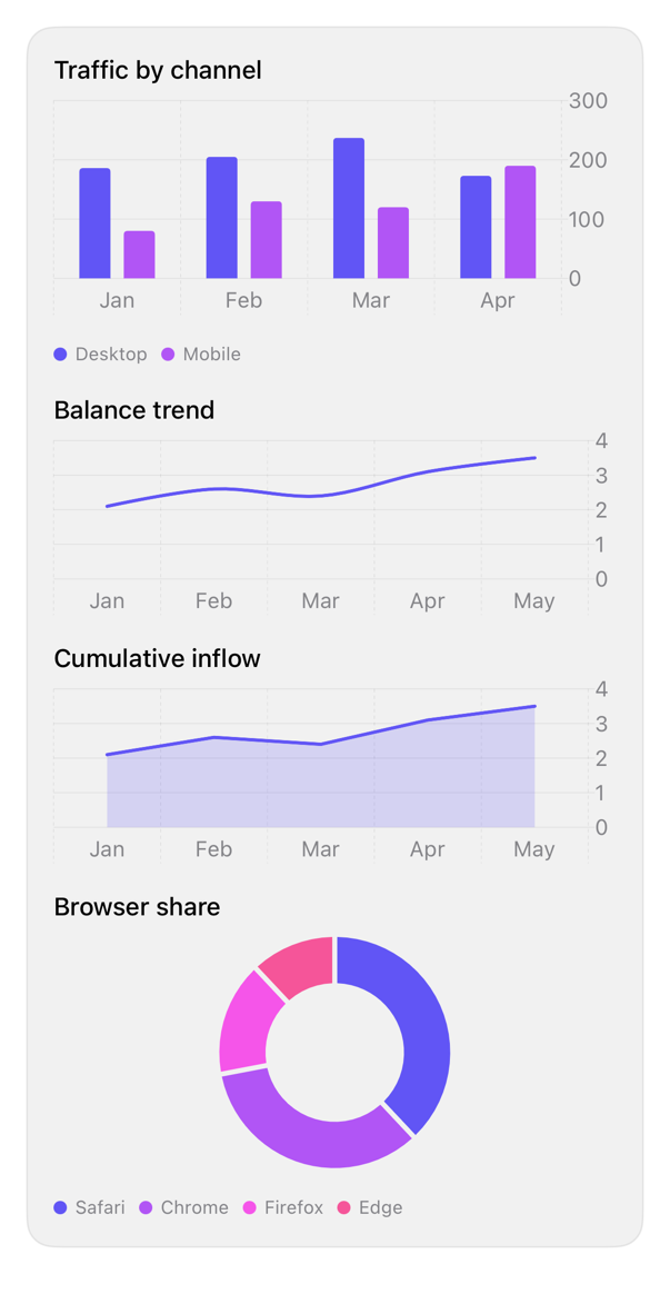
On iPad
The same installed source at a regular width. It adapts its layout without a separate design.
Install
With the sweetui tool (brew install mangobyte-dev/tap/sweetui):
sweetui install chart --destination Sources/YourFeature/ComponentsInstalls in order: chart 0.1.3. Point --destination at a folder inside the consuming target's sources.
Usage
Chart(data) { row in
    BarMark(
        x: .value("Month", row.month),
        y: .value("Visits", row.visits)
    )
    .foregroundStyle(by: .value("Channel", row.channel))
    .position(by: .value("Channel", row.channel))
}
.registryChart()
.frame(height: 180)
Accessibility contract
- MUST carry accessibilityLabel/accessibilityValue on marks or Chart (VoiceOver, audio graph).
- Legend below plot names series, avoiding color-only; matches palette.
- Axis: footnote, secondary emphasis. Grid/ticks: theme border, Dynamic Type, color-scheme.
- Category marks: accent-derived; first=accent, rest hue-rotated. Single-series SHOULD use foregroundStyle(TintShapeStyle()) or RegistryChartPalette, else default.
- Palette: theme chartPalette (accent tints, fixed spectrum, gray ramp); spectrum/gray stay distinct despite low chroma. Color-scheme aware.
Details
| Kind | component |
| Version | 0.1.3 |
| Platforms | iOS 26.0+ |
| Dependencies | none |
| Source | Registry/sources/components/RegistryChart.swift |
| Xcode preview | Chart |