component
toggle
Button treatment, Toggle.
togglebuttonselectionformattingstyle
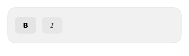
On iPad
The same installed source at a regular width. It adapts its layout without a separate design.


Install
With the sweetui tool (brew install mangobyte-dev/tap/sweetui):
sweetui install toggle --destination Sources/YourFeature/ComponentsInstalls in order: button 0.5.2, toggle 0.2.1. Point --destination at a folder inside the consuming target's sources.
Usage
// Content layer only. In toolbars, tab bars, or floating chrome the system supplies Liquid Glass; use .buttonStyle(.glass) or .buttonStyle(.glassProminent) there instead of .registry styles.

@State private var bold = false

Toggle("Bold", systemImage: "bold", isOn: $bold)
    .toggleStyle(.registryToggle)
Accessibility contract
- State, activation retained.
- Icon-only needs labels.
- Opacity, selected beyond color.
- Dynamic Type, enabled, size, direction.
Details
| Kind | component |
| Version | 0.2.1 |
| Platforms | iOS 26.0+ |
| Dependencies | button |
| Source | Registry/sources/components/RegistryToggleStyle.swift |
| Xcode preview | Toggle |