block
settings-section
Composes select, separator, button; structure, separators, messages, caller-owned toggle/picker/action rows.
settingspreferencessectiontoggleform
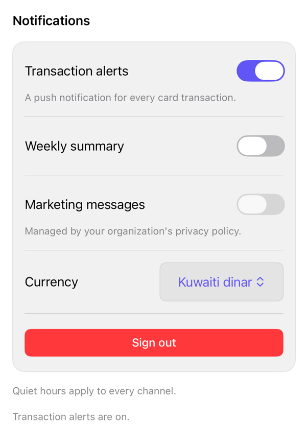
On iPad
The same installed source at a regular width. It adapts its layout without a separate design.
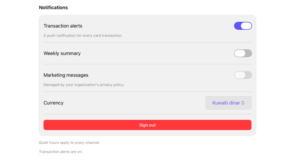
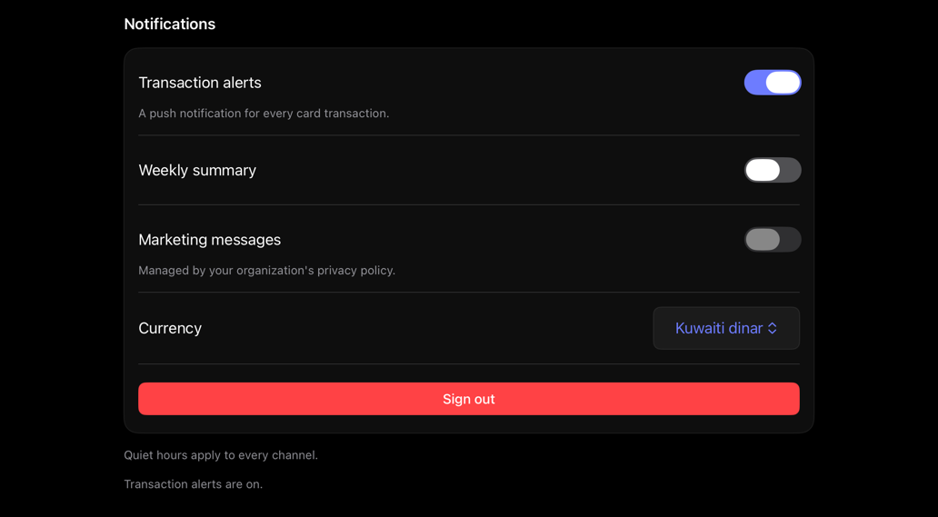
Install
With the sweetui tool (brew install mangobyte-dev/tap/sweetui):
sweetui install settings-section --destination Sources/YourFeature/ComponentsInstalls in order: select 0.2.1, separator 0.2.1, button 0.5.2, settings-section 0.1.2. Point --destination at a folder inside the consuming target's sources.
Usage
@State private var alertsEnabled = true
@State private var marketingEnabled = false
@State private var currency = "KWD"
let marketingAllowed = false

SettingsSection(
    "Notifications",
    footer: Text("Quiet hours apply to every channel.")
) {
    Toggle("Transaction alerts", isOn: $alertsEnabled)
        .settingsRowDescription(Text("A push notification for every card transaction."))

    Toggle("Marketing messages", isOn: $marketingEnabled)
        .settingsRowDisabled(
            !marketingAllowed,
            explanation: Text("Managed by your organization's privacy policy.")
        )

    LabeledContent("Currency") {
        Picker("Currency", selection: $currency) {
            Text("Kuwaiti dinar").tag("KWD")
            Text("US dollar").tag("USD")
        }
        .registrySelect()
    }

    Button("Sign out", role: .destructive) { }
        .buttonStyle(.registry)
}
Accessibility contract
- Section title: header trait; rotor jumps sections.
- Rows: native semantics, not hidden/renamed; name = label. `.labelsHidden()` label MUST get explicit label.
- settingsRowDisabled = native .disabled; dims via style, VoiceOver: dimmed. Description/explanation: contrast, outside-subtree.
- Disabled explanation: under-control static-text, not a hint. Enabled+explanation: unrepresentable, cleared-when-enabled.
- Row order: control, description, explanation, footer; follows declaration order (VoiceOver, Full-Keyboard-Access).
- System styles (.headline/.footnote), 44pt row-height, no fixed-heights: Dynamic Type/RTL reflow. No rotor-grouping (`accessibilityElement-children-contain`); controls stay own-elements.
Details
| Kind | block |
| Version | 0.1.2 |
| Platforms | iOS 26.0+ |
| Dependencies | select, separator, button |
| Source | Registry/sources/blocks/SettingsSection.swift |
| Xcode preview | Settings Section |