component
input
Styles TextField/SecureField: fill, focus, disabled, invalid.
inputtext-fieldsecure-fieldformstyle
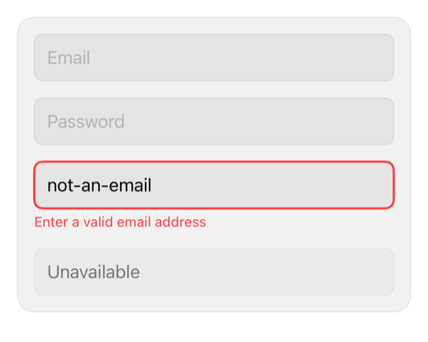
On iPad
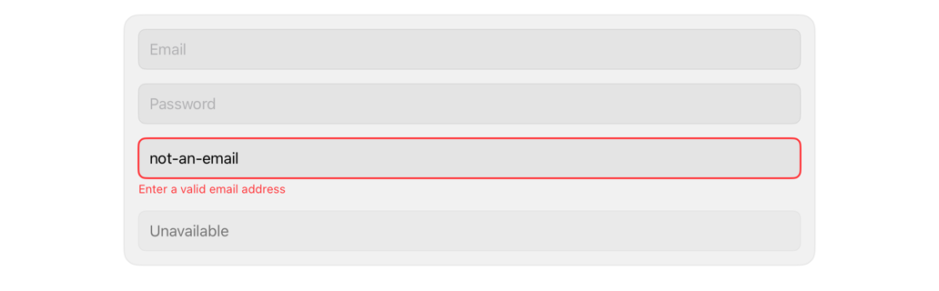
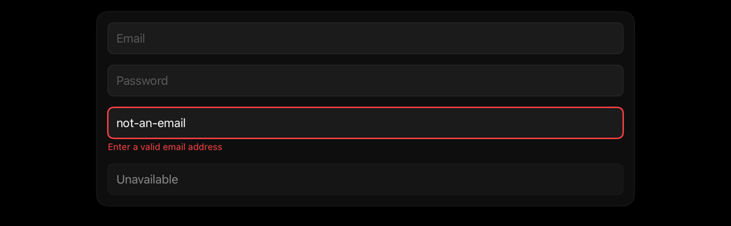
The same installed source at a regular width. It adapts its layout without a separate design.
Install
With the sweetui tool (brew install mangobyte-dev/tap/sweetui):
sweetui install input --destination Sources/YourFeature/ComponentsInstalls in order: input 0.5.1. Point --destination at a folder inside the consuming target's sources.
Usage
@State private var email = ""
@State private var password = ""

// The title is placeholder text to VoiceOver; the explicit label names
// the field once it holds text.
TextField("Email", text: $email)
    .textFieldStyle(.registryInput)
    .accessibilityLabel("Email")

SecureField("Password", text: $password)
    .textFieldStyle(.registryInput)
    .accessibilityLabel("Password")

TextField("Email", text: $email)
    .textFieldStyle(RegistryInputStyle(isInvalid: true))
    .accessibilityLabel("Email")
    .accessibilityHint("Enter a valid email address")
Accessibility contract
- MUST have accessibilityLabel = title (placeholder-only; iOS 27: title-only/label+prompt initializers expose none). Showcase audit rejects unlabeled, typed-but-unnamed fields.
- Preserves editing, keyboard, autofill.
- Focus: accent ring; invalid: negative border wins; SHOULD pair message.
- Invalid: MUST have visible copy, hint.
- Inherits Dynamic Type, direction, state.
- 44-point min height; empty: full tap target, any size.
Details
| Kind | component |
| Version | 0.5.1 |
| Platforms | iOS 26.0+ |
| Dependencies | none |
| Source | Registry/sources/components/RegistryInputStyle.swift |
| Xcode preview | Input States |