component
combobox
Searchable single-selection: search field, filtered list, binding-driven selection, native empty state.
comboboxsearchselectautocompletepickershadcn
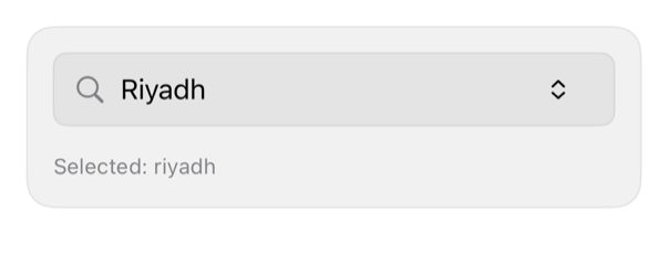
On iPad
The same installed source at a regular width. It adapts its layout without a separate design.


Install
With the sweetui tool (brew install mangobyte-dev/tap/sweetui):
sweetui install combobox --destination Sources/YourFeature/ComponentsInstalls in order: button 0.5.2, input-group 0.2.1, avatar 0.2.1, separator 0.2.1, badge 0.3.2, item 0.2.2, empty 0.1.1, combobox 0.1.1. Point --destination at a folder inside the consuming target's sources.
Usage
@State private var timezone: String? = "riyadh"

Combobox(
    selection: $timezone,
    options: [
        ComboboxOption(id: "kuwait", title: "Kuwait City", systemImage: "clock"),
        ComboboxOption(id: "riyadh", title: "Riyadh", systemImage: "clock")
    ],
    prompt: "Search time zones",
    emptyDescription: Text("Try a city name.")
)
Accessibility contract
- Field label: prompt, query binding; options: native Buttons, titled, Voice-Control ready.
- Selected: isSelected trait, checkmark; symbol decorative, hidden.
- No match: ContentUnavailableView on registry surface (caller's empty title/description).
- Focus: list opens inline below, pushes content; MUST NOT hide controls. No popover (full sheet on compact iPhone).
Details
| Kind | component |
| Version | 0.1.1 |
| Platforms | iOS 26.0+ |
| Dependencies | input-group, item, empty, separator, button |
| Source | Registry/sources/components/Combobox.swift |
| Xcode preview | Combobox |