component
button
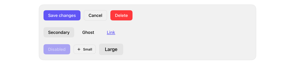
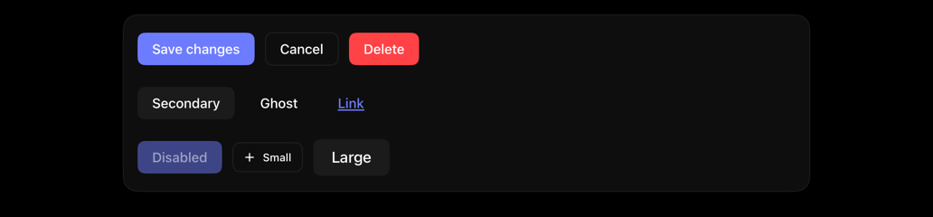
Styles SwiftUI buttons: shadcn-inspired variants; preserves roles, sizing.
buttoncontrolactionstyleshadcn
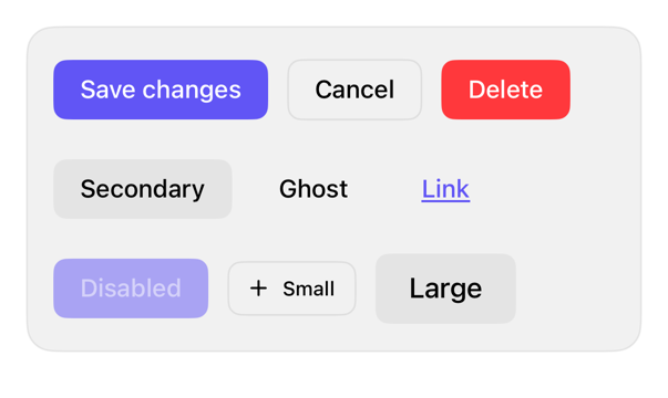
On iPad
The same installed source at a regular width. It adapts its layout without a separate design.
Install
With the sweetui tool (brew install mangobyte-dev/tap/sweetui):
sweetui install button --destination Sources/YourFeature/ComponentsInstalls in order: button 0.5.2. Point --destination at a folder inside the consuming target's sources.
Usage
// Content layer only. In toolbars, tab bars, or floating chrome the system supplies Liquid Glass; use .buttonStyle(.glass) or .buttonStyle(.glassProminent) there instead of .registry styles.

Button("Save changes") {}
    .buttonStyle(.registry)

Button("Cancel") {}
    .buttonStyle(.registryOutline)

Button("Delete", role: .destructive) {}
    .buttonStyle(.registry)
Accessibility contract
- Preserves Button semantics, ButtonRole.
- Keeps 44 by 44 point minimum area, any size.
- Label: one line, MUST NOT wrap; scales before truncating. Large sizes SHOULD get full-width or stacked room.
- Reads enabled state. Destructive: negative fill (primary), negative text (outline, secondary, ghost, link).
- iPad: hoverEffect keeps pointer effect; custom ButtonStyle drops it. iOS 27, XCTest hover: pixels unchanged.
Details
| Kind | component |
| Version | 0.5.2 |
| Platforms | iOS 26.0+ |
| Dependencies | none |
| Source | Registry/sources/components/RegistryButtonStyle.swift |
| Xcode preview | Button Variants |