component
badge
Primary, secondary, outline, positive, destructive: Text/Label treatments.
badgelabelstatuscategorymodifier
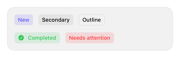
On iPad
The same installed source at a regular width. It adapts its layout without a separate design.


Install
With the sweetui tool (brew install mangobyte-dev/tap/sweetui):
sweetui install badge --destination Sources/YourFeature/ComponentsInstalls in order: badge 0.3.2. Point --destination at a folder inside the consuming target's sources.
Usage
Text("New")
    .registryBadge()

Label("Completed", systemImage: "checkmark.circle.fill")
    .registryBadge(.positive)
Accessibility contract
- One line, intrinsic width.
- Preserves semantics, reading order.
- System style; grows Dynamic Type.
- Inherits layout direction; locale-aware.
- Positive/destructive: same fill, differ hue; pair symbol, MUST NOT rely on color alone.
Details
| Kind | component |
| Version | 0.3.2 |
| Platforms | iOS 26.0+ |
| Dependencies | none |
| Source | Registry/sources/components/RegistryBadge.swift |
| Xcode preview | Badge Variants |