recipe
slider
Slider: tint, sizing; caller-owned value, labels.
slidervaluerangecontrolguidance
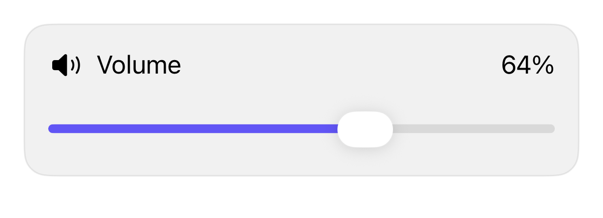
On iPad
The same installed source at a regular width. It adapts its layout without a separate design.


Install
Nothing to install
Copy the snippet below. The native API is the whole treatment.
Usage
@State private var volume = 64.0

Slider(value: $volume, in: 0...100, step: 1) {
    Text("Volume")
} minimumValueLabel: {
    Image(systemName: "speaker.fill")
        .accessibilityHidden(true)
} maximumValueLabel: {
    Image(systemName: "speaker.wave.3.fill")
        .accessibilityHidden(true)
}
.controlSize(.large)
.registryItem("slider")
Why native is enough
Use the native Slider with .tint(_:) and .controlSize(_:) where the design needs them. The registry adds no wrapper: those modifiers only forward environment values the control already respects.
Accessibility contract
- Retains Slider semantics, gestures; caller-owned value, bounds, step, callbacks.
- Needs meaningful label; supports min/max labels; inherits size, enabled, direction (overridable).
Details
| Kind | recipe |
| Version | 0.3.1 |
| Platforms | iOS 26.0+ |
| Dependencies | none |
| Source | none (native guidance) |