block
preview-02
Theme wall: 35 cards, registry + native; adaptive grid, compact one-column.
previewthemeshowcasecardscreateshadcndashboard
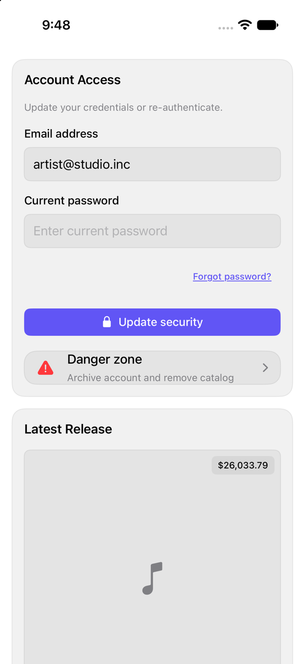
On iPad
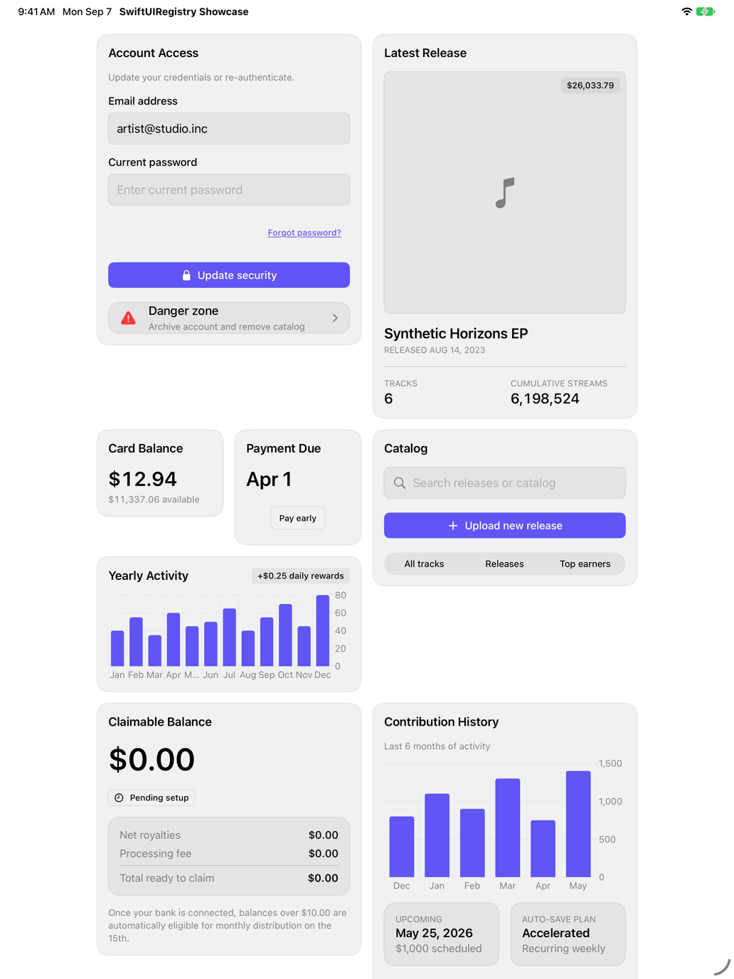
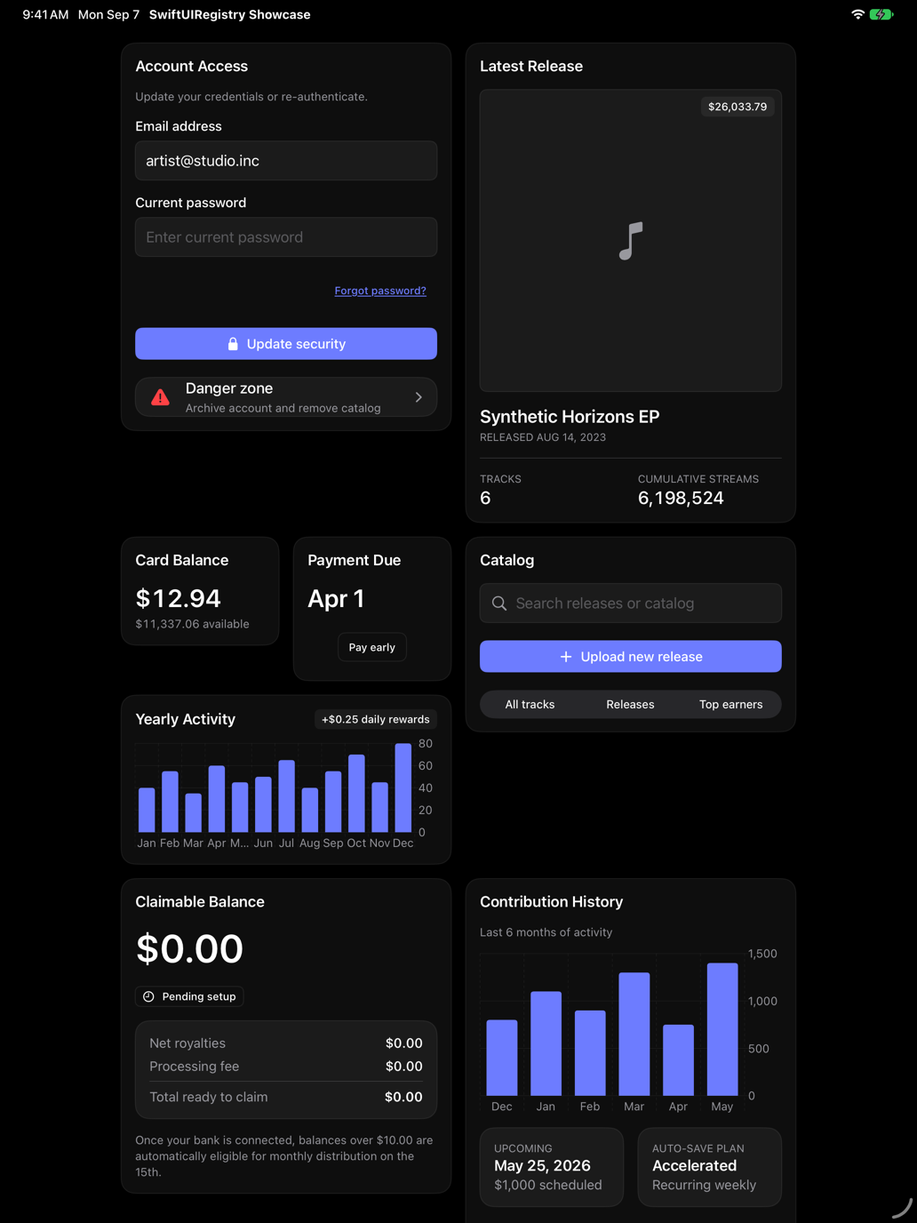
The same installed source at a regular width. It adapts its layout without a separate design.
Install
With the sweetui tool (brew install mangobyte-dev/tap/sweetui):
sweetui install preview-02 --destination Sources/YourFeature/ComponentsInstalls in order: card 0.2.1, input 0.5.1, field 0.1.2, button 0.5.2, avatar 0.2.1, separator 0.2.1, badge 0.3.2, item 0.2.2, chart 0.1.3, input-group 0.2.1, toggle 0.2.1, toggle-group 0.2.1, empty 0.1.1, accordion 0.2.2, skeleton 0.2.2, checkbox 0.3.2, breadcrumb 0.1.2, select 0.2.1, textarea 0.4.1, progress 0.2.1, table 0.1.1, combobox 0.1.1, spinner 0.2.1, preview-02 0.3.1. Point --destination at a folder inside the consuming target's sources.
Usage
PreviewWall02()Accessibility contract
- 35 cards, one wall; regular: adaptive grid; compact: plain-non-lazy-VStack, all off-screen too (capture-route audit).
- Every control: accessibility-label; SF-Symbol hidden; no unlabeled control (buttons, images, switches, fields, sliders, menus, pickers).
- Table, sidebar, combobox, charts, date picker: native selection, scrolling, semantics; spoken labels, not glyphs.
- Cards: native GroupBox + controls, card-surface; respects Dynamic Type, color-scheme, direction, no-per-card-handling.
Details
| Kind | block |
| Version | 0.3.1 |
| Platforms | iOS 26.0+ |
| Dependencies | card, field, input, button, item, badge, separator, chart, input-group, toggle-group, empty, accordion, skeleton, checkbox, breadcrumb, select, textarea, progress, table, combobox, spinner |
| Source | Registry/sources/blocks/Preview02/PreviewWall02.swift |
| Xcode preview | Preview Wall 02 |