component
accordion
Styles DisclosureGroup: full-width header, trailing chevron; keeps caller styling.
accordiondisclosurecollapsibleexpandfaqshadcn
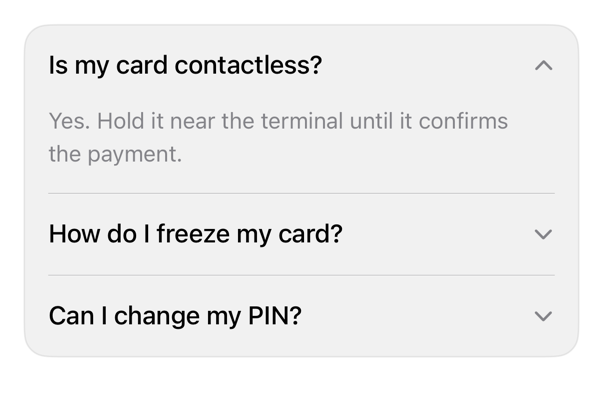
On iPad
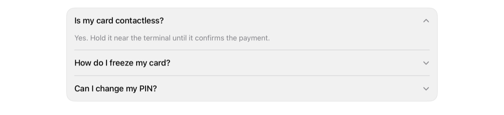
The same installed source at a regular width. It adapts its layout without a separate design.
Install
With the sweetui tool (brew install mangobyte-dev/tap/sweetui):
sweetui install accordion --destination Sources/YourFeature/ComponentsInstalls in order: separator 0.2.1, accordion 0.2.2. Point --destination at a folder inside the consuming target's sources.
Usage
@State private var isExpanded = false

DisclosureGroup("How do I freeze my card?", isExpanded: $isExpanded) {
    Text("Open the card, then choose Freeze.")
}
.disclosureGroupStyle(.registryAccordion)
Accessibility contract
- Header: plain Button bound to isExpanded.
- Value: Expanded/Collapsed, no selection trait, one-word VoiceOver.
- Chevron decorative, hidden; header keeps 44 point minimum height.
- Tap: snappy curve; Reduce Motion immediate; code-driven uses caller's animation.
- iPad: plain style drops automatic pointer effect; hoverEffect restores, shape auto-picked.
Details
| Kind | component |
| Version | 0.2.2 |
| Platforms | iOS 26.0+ |
| Dependencies | separator |
| Source | Registry/sources/components/RegistryAccordionStyle.swift |
| Xcode preview | Accordion |